

Walk into a kitchen from ten years ago and you can usually date it within a season. The all-white everything. The gray-on-gray-on-gray. The barn door bolted to a suburban pantry.
Trends move fast, and kitchens are the slowest, most expensive room to change your mind about.
Some of these regrets cost a few hundred bucks to undo. Others run into five figures once you factor in stone, plumbing, and a contractor’s day rate.
The frustrating part? A lot of them looked incredible in the showroom and the Pinterest board. Then real life — grease, fingerprints, spilled wine, resale — showed up.
Here are 27 kitchen trends people are already wishing they’d skipped.
1. The All-White Kitchen
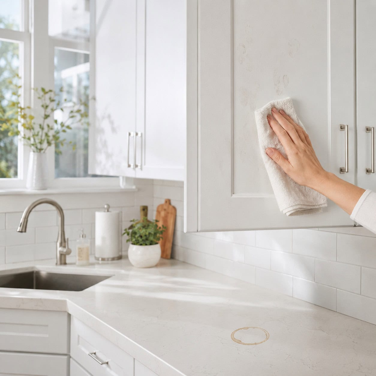
It was the defining look of the 2010s. Crisp, bright, endlessly photographed.
Then people had to live in one. Every fingerprint on the cabinet, every splash by the range, every coffee ring on the counter announces itself.
Designers have swung hard the other way. According to Kitchen Cabinet Kings, NKBA data for 2026 points squarely at warm neutrals and natural wood tones.
Which means the pure-white remodel that felt so timeless now reads as a specific decade. Sterile. Cold. Dated.
2. Cool Gray Everything
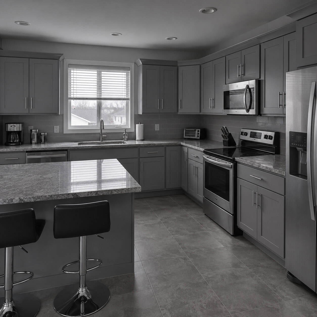
Gray was the safe bet. Nobody got fired for picking greige.
Cool gray cabinets, a cool gray counter, chrome pulls, gray-washed floors. Stacked together, the whole thing feels like a dentist’s waiting room.
Homeowners describe it the same way over and over: no warmth, no personality. One piece on the trends people already regret in 2026 put earthy tones firmly back on top.
Gray didn’t offend anyone. It also didn’t make anyone feel anything.
3. The Tuscan-Style Kitchen
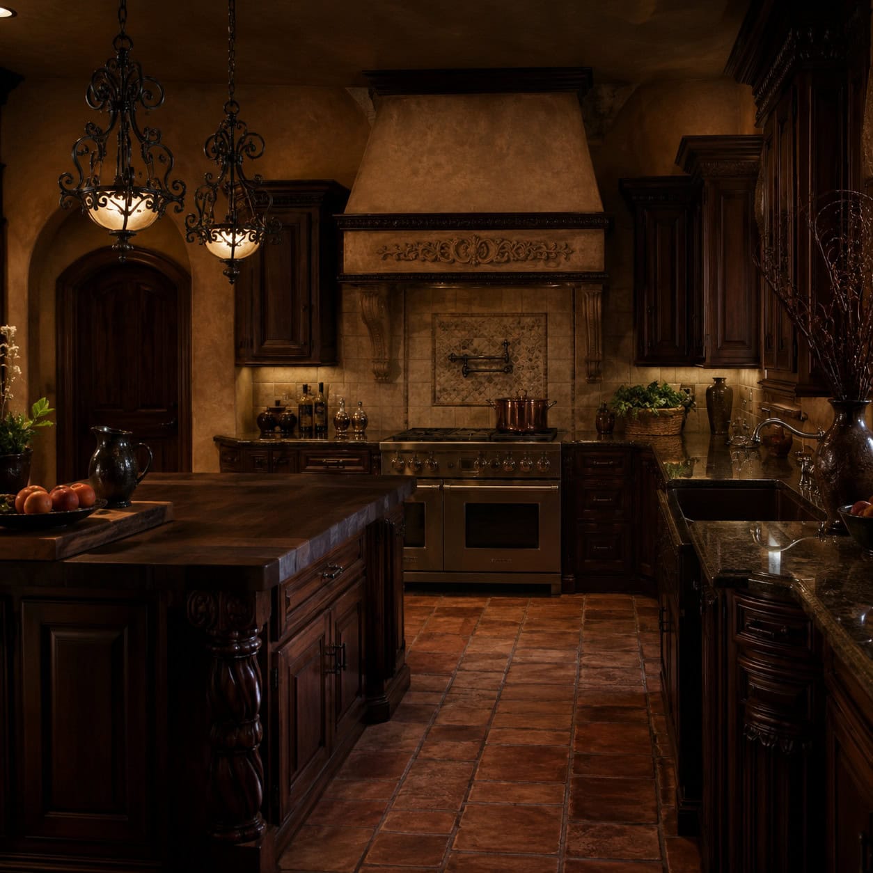
Remember when every kitchen wanted to be a villa? Dark cherry cabinets, terra-cotta tile, faux-aged everything, a rooster somewhere.
The hotter the trend, the shorter it lives. Tuscan burned bright and burned out.
Ask anyone who judges kitchen design competitions — the Old-World kitchen gets ripped out more than almost anything. Bob Vila’s rundown of kitchen trends you might regret puts it front and center.
Those heavy browns eat all the light in the room. And faux-aged finishes only ever look genuinely aged in one way: old.
4. Modern Farmhouse Overload
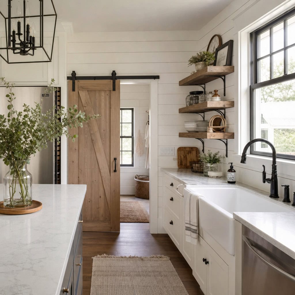
Shiplap on the walls. A barn door on a track. The plain white apron sink front and center.
One or two of these? Charming. All of them at once? A costume.
The full farmhouse package screams a very specific window of time — roughly 2016 to 2021. Buyers can smell it.
Rustic touches age fine on their own. A reclaimed wood shelf, a farmhouse sink. Load the whole room with the theme and you’ve stamped a date on it.
5. Wall-to-Wall Open Shelving
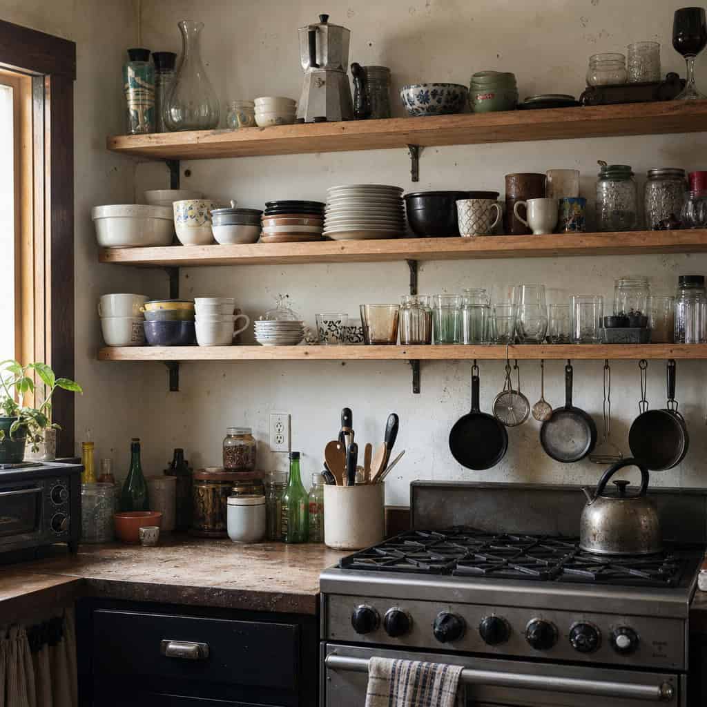
It photographs like a dream. Neat rows of matching dishes, a trailing plant, everything perfectly spaced.
Now try living with it.
Every open shelf collects grease and dust, especially anywhere near the stove. And unless you keep it styled like a magazine shoot every single day, it just looks cluttered.
The good news is this one’s cheap to reverse. Cabinet doors go back on without much drama, which is why so many people quietly put them back.
6. Fluted and Reeded Cabinet Fronts
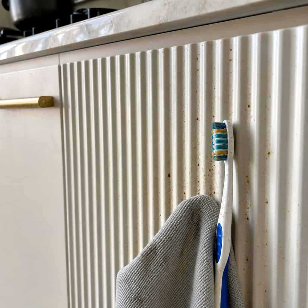
The freshest regret on the whole list. Those vertical grooves looked so rich, so custom, so expensive.
Then someone dripped raw chicken juice down them.
Every one of those little channels traps grime, and cleaning them means a toothbrush and patience. Designers who loved the look are already backing away from it.
Looks luxe. Lives badly.
7. The All-Matte-Black Kitchen
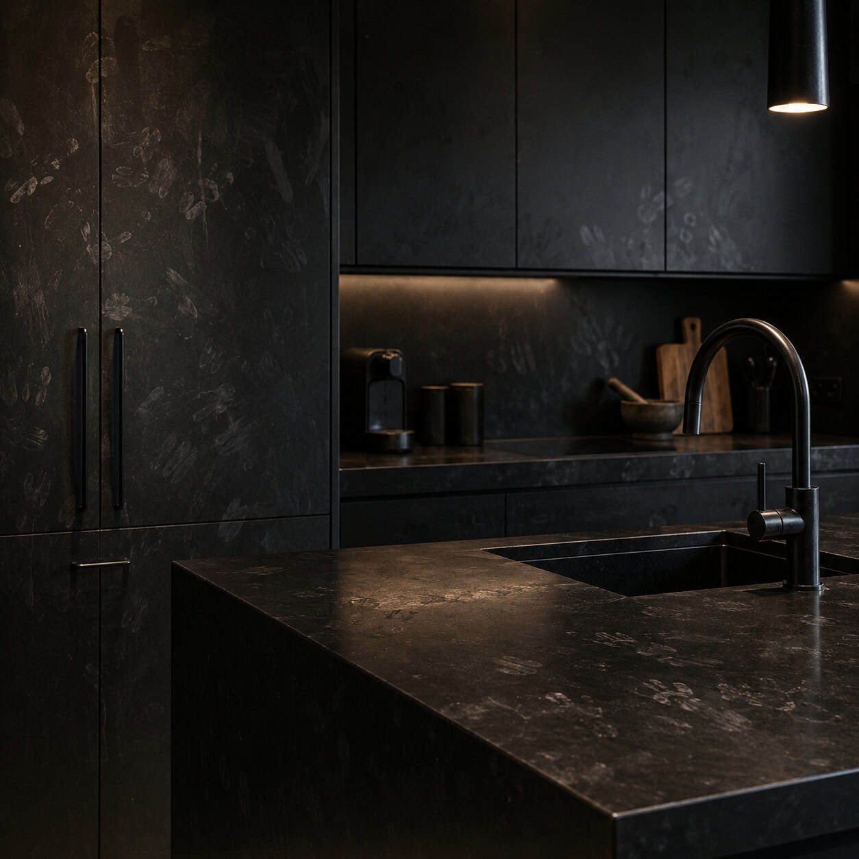
Matte black cabinets, matte black faucet, matte black hardware. Dramatic, moody, expensive-looking.
And a magnet for every fingerprint, water spot, and hard-water streak you own.
Matte black also gets heavy fast. It closes a room in, and it locks you into a palette you can’t tweak without repainting everything.
Want the dark look without the daily wiping? A satin or semi-gloss finish is the smarter middle ground. Skip the full matte.
8. The Waterfall-Edge Island
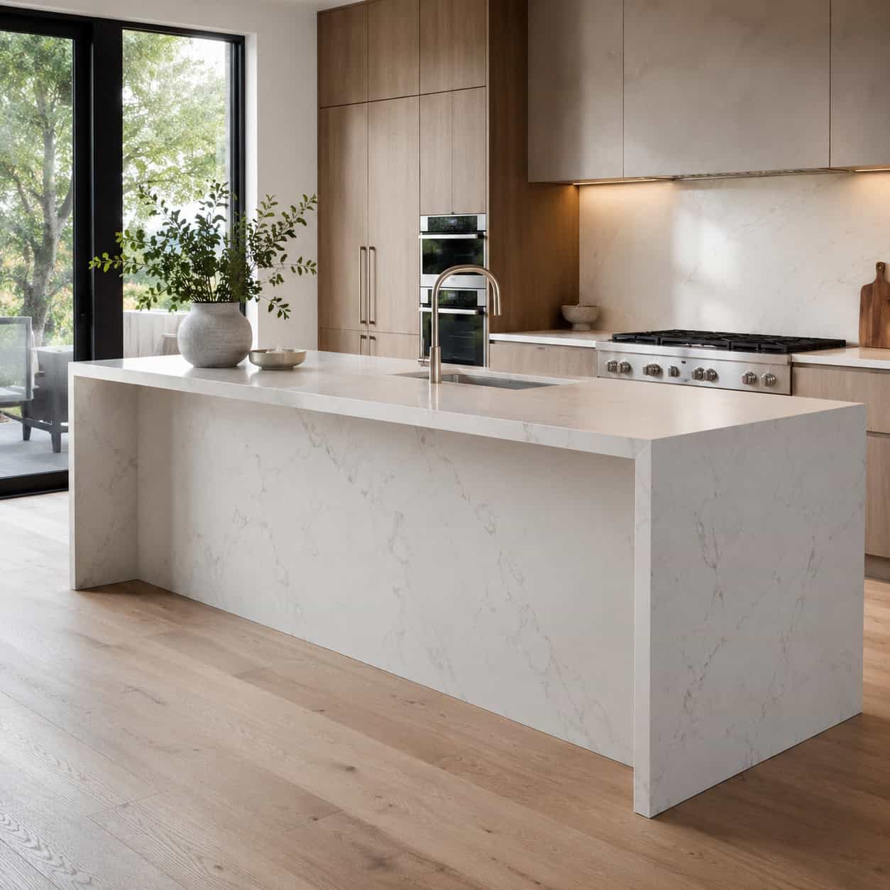
Running the stone slab straight down both sides of the island looks slick. It also doubles your most expensive material.
You’re paying for a second and third slab of quartz or marble to cover the sides — easily a few thousand dollars extra depending on the stone.
It only suits very contemporary rooms. Drop it into a traditional kitchen and it fights everything around it.
And those solid stone ends can block the overhang you need for stools. Doubling the cost to lose your seating is a rough trade.
9. Heavy High-Contrast Two-Tone Cabinets
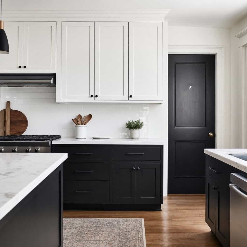
Two-tone cabinets aren’t going anywhere. The version you picked is what matters.
Stark black-and-white or bold, high-contrast pairings date faster than soft tonal combinations. The eye gets tired of the drama.
Contrast also punishes you. Any small defect, chip, or mismatched sheen jumps right out on that crisp line between dark and light.
Pick two tones a few shades apart instead of two ends of the spectrum. It’ll still look intentional in ten years.
10. Marble Countertops
Nothing looks quite like real marble. That soft veining, that cool glow, that sense that money lives here.
And nothing punishes a busy kitchen quite like it either.
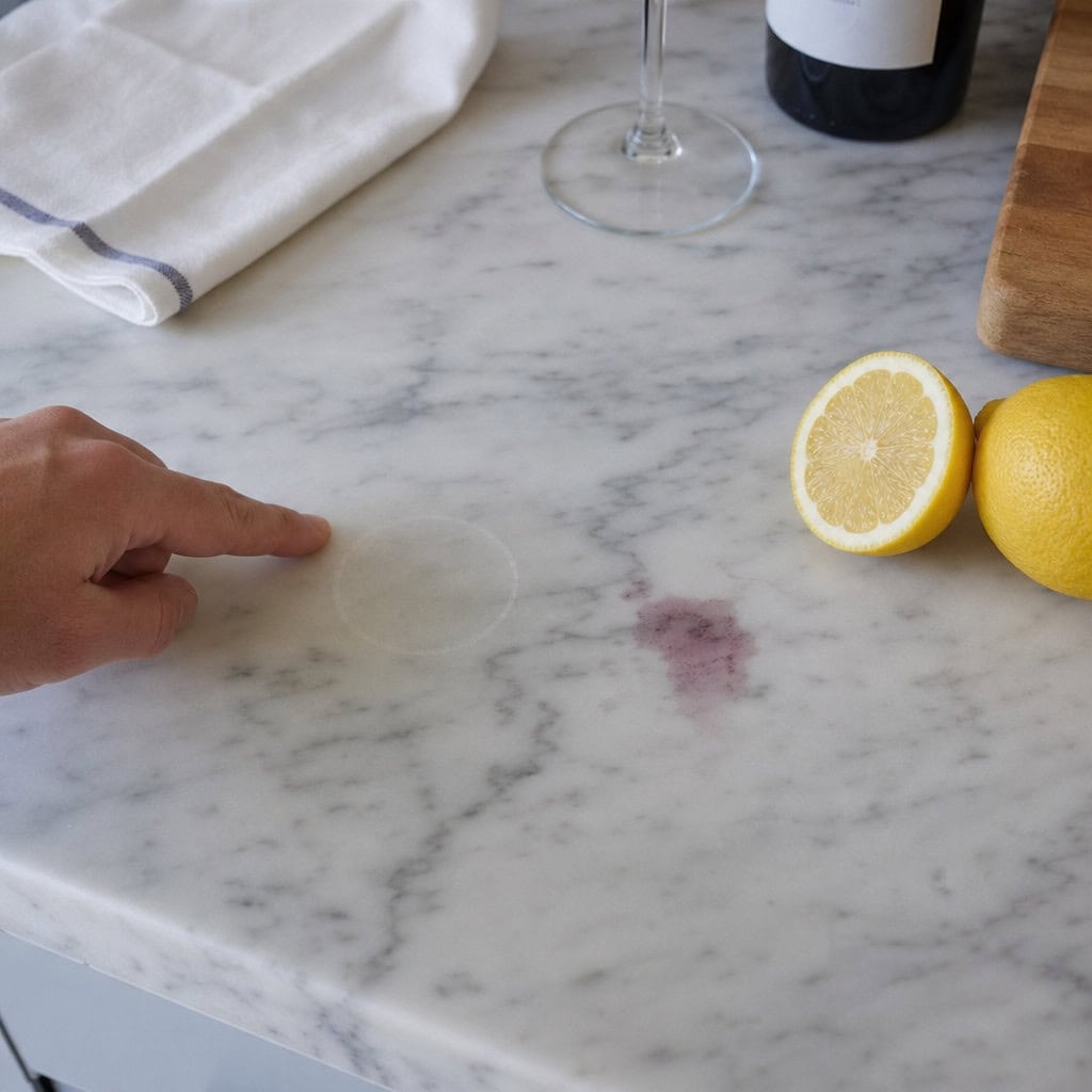
Marble is soft and porous. It stains, it etches, it scratches, and it chips. A red-wine glass left overnight leaves a ring. A squeeze of lemon or a splash of vinegar eats a dull spot right into the polish, because the acid reacts with the calcium in the stone.
That etching isn’t dirt. You can’t scrub it out. Fixing it means honing and re-polishing the slab, which runs a couple hundred dollars per repair from a stone pro — and it comes back the next time someone slices a tomato and wipes with the wrong cleaner.
Sealing helps with stains but does nothing for etching. And you have to re-seal every six to twelve months to keep the stain protection alive.
Real Carrara or Calacatta marble runs roughly $75 to $250 per square foot installed, and the prettier the slab, the higher the number. That’s a lot of money to baby a surface you’re supposed to cook on.
This is why quartz gets recommended so often now. Engineered quartz mimics the marble look, doesn’t need sealing, and shrugs off wine and lemon juice. If you want the veining without the anxiety, that’s the swap. Save real marble for the bar or a low-traffic island.
11. Touchless Motion-Sensor Faucets
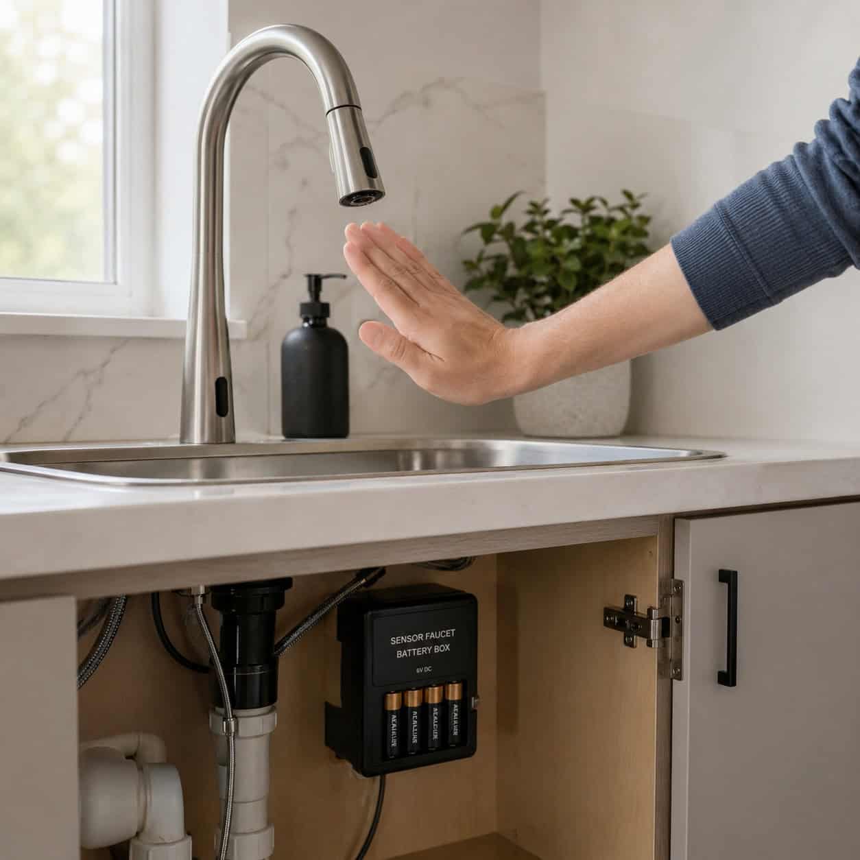
Wave your hand, water flows. Perfect for when you’re elbow-deep in raw ground beef, right?
In practice, owners get worn down by it. The sensor misreads a passing sleeve and turns itself on. It fails to trigger when your hands are actually full.
Then there’s the battery pack or the transformer under the sink to keep alive, plus electronics that can fail years before a manual valve ever would.
Plenty of people who splurged on touchless say they’d trade it back for a good pull-down with a lever. A quality manual faucet just works, every time, for decades.
12. The Pot Filler
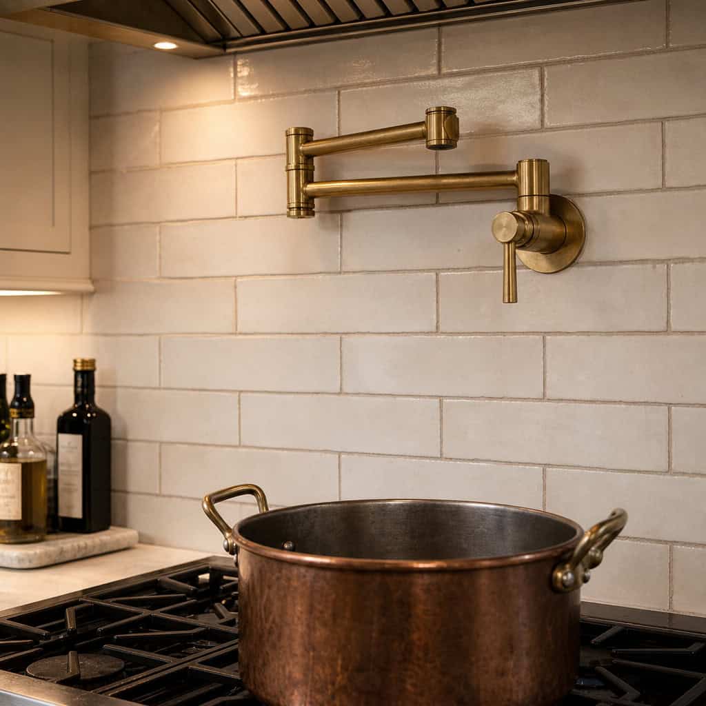
The folding faucet mounted over the range. Nothing says serious cook quite like it.
Nothing gets used quite as little, either.
You fill the pot once at the stove. Then you still have to carry the full, heavy, boiling pot to the sink to drain it. The filler solved half a problem.
Between the added plumbing run and the fixture itself, it’s real money. Most people who have one admit a second prep sink would’ve earned its keep far better.
13. The Over-the-Range Microwave
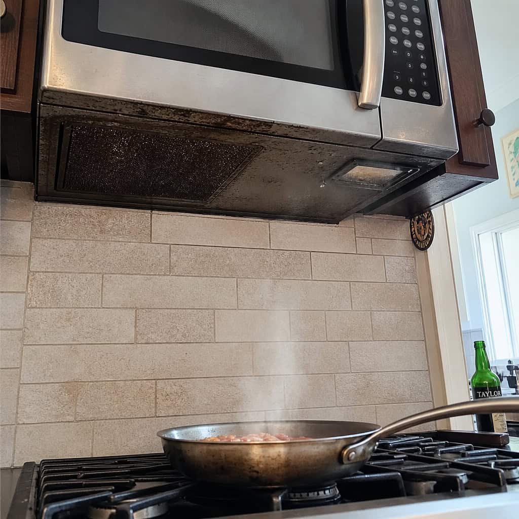
Builders sold it as smart space-saving for years. Two appliances, one footprint.
Live with it and the problems pile up. It sits at an awkward height, so anything hot comes down toward your face. It catches grease from the cooktop below.
And it’s a weak ventilator. A combo microwave-hood moves a fraction of the air a real range hood does, and half of them just recirculate the steam back into the room.
The fix is popular for a reason: pull the microwave, put in a proper hood, and stash the microwave in a drawer or on the counter.
14. The Oversized Island
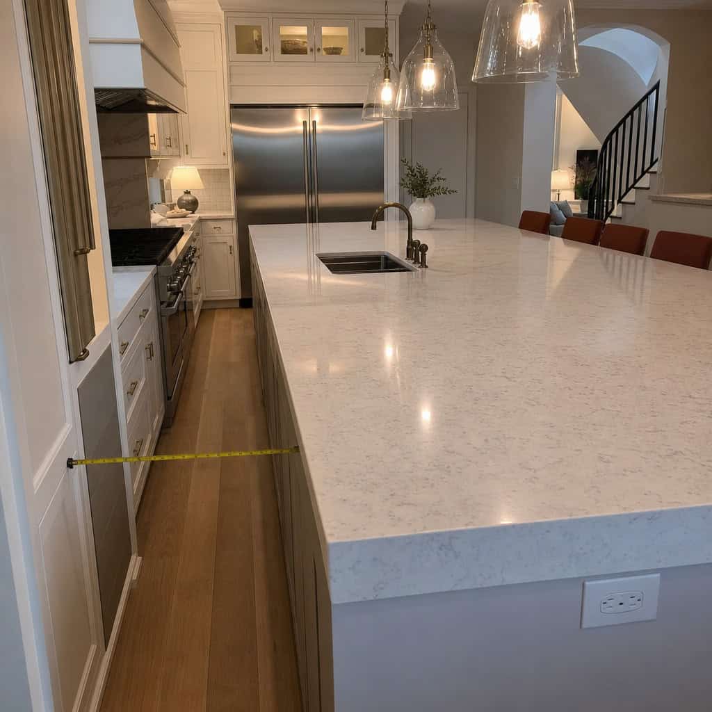
Bigger was better for a solid decade. The island grew until it swallowed the room.
Then you couldn’t walk around it. A giant island creates bottlenecks, forces awkward squeezes, and marooned the seating too far from the fridge to be useful.
There’s an actual rule here. The NKBA recommends around 42 to 48 inches of clearance around an island, and Homes & Gardens lays out why those distances matter for real cooking.
Blow past that and you’ve built an expensive obstacle. Shrinking a too-big island later means new cabinetry and a new slab — thousands, twice.
15. The Touchscreen Smart Fridge

A giant tablet in the fridge door. Check the weather, watch a recipe, see inside without opening it.
Big money for a screen that ages faster than the appliance behind it.
Here’s the mismatch that stings. A refrigerator’s compressor and cabinet are built to last 10 to 15 years. The software running that touchscreen typically gets supported for 3 to 7 before the apps stop updating and the interface starts feeling ancient.
The Cool Down has covered how smart fridge software outlives its usefulness long before the fridge does.
And when the screen itself dies? Touchscreen repairs on these run roughly $300 to $700 — for a feature that has nothing to do with keeping your milk cold.
The move most people wish they’d made: buy a great dumb fridge that keeps food cold for fifteen years, and stick a $150 tablet on the wall if you want a screen. When the tablet dies, you buy another one. The fridge keeps running.
16. The Appliance Garage
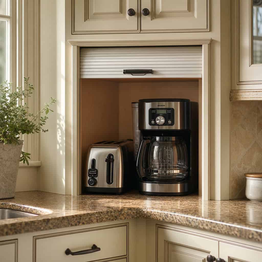
That little roll-top cubby that hides the toaster and coffee maker. Tidy in theory.
In practice it swallows a chunk of your best counter-height cabinet space to serve exactly one purpose.
Prime real estate in a kitchen is the stuff within easy reach. Handing a big slice of it to a garage door feels clever until you need that space for anything else.
A deep drawer or a walk-in pantry hides the same clutter without eating the footprint.
17. Bold-Colored Appliances
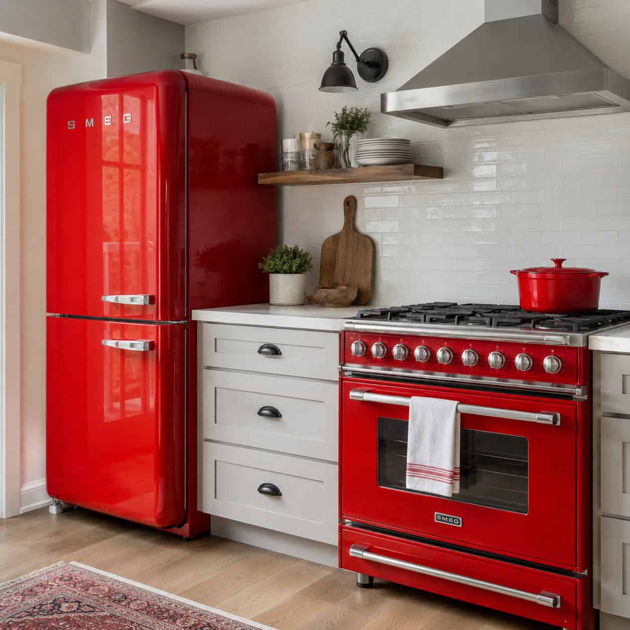
A cherry-red range. A cobalt fridge. It pops in every photo.
Then it doesn’t. Bold appliance colors age hard and fast, and you’re stuck with the boldest, most expensive things in the room.
Remember avocado green and harvest gold? Every generation gets its color it can’t wait to rip out later.
Designers keep warning that practicality wins in the end. Put the color somewhere cheap to change — a wall, a runner, a set of stools — not on a $4,000 range.
18. The Gap Above the Cabinets
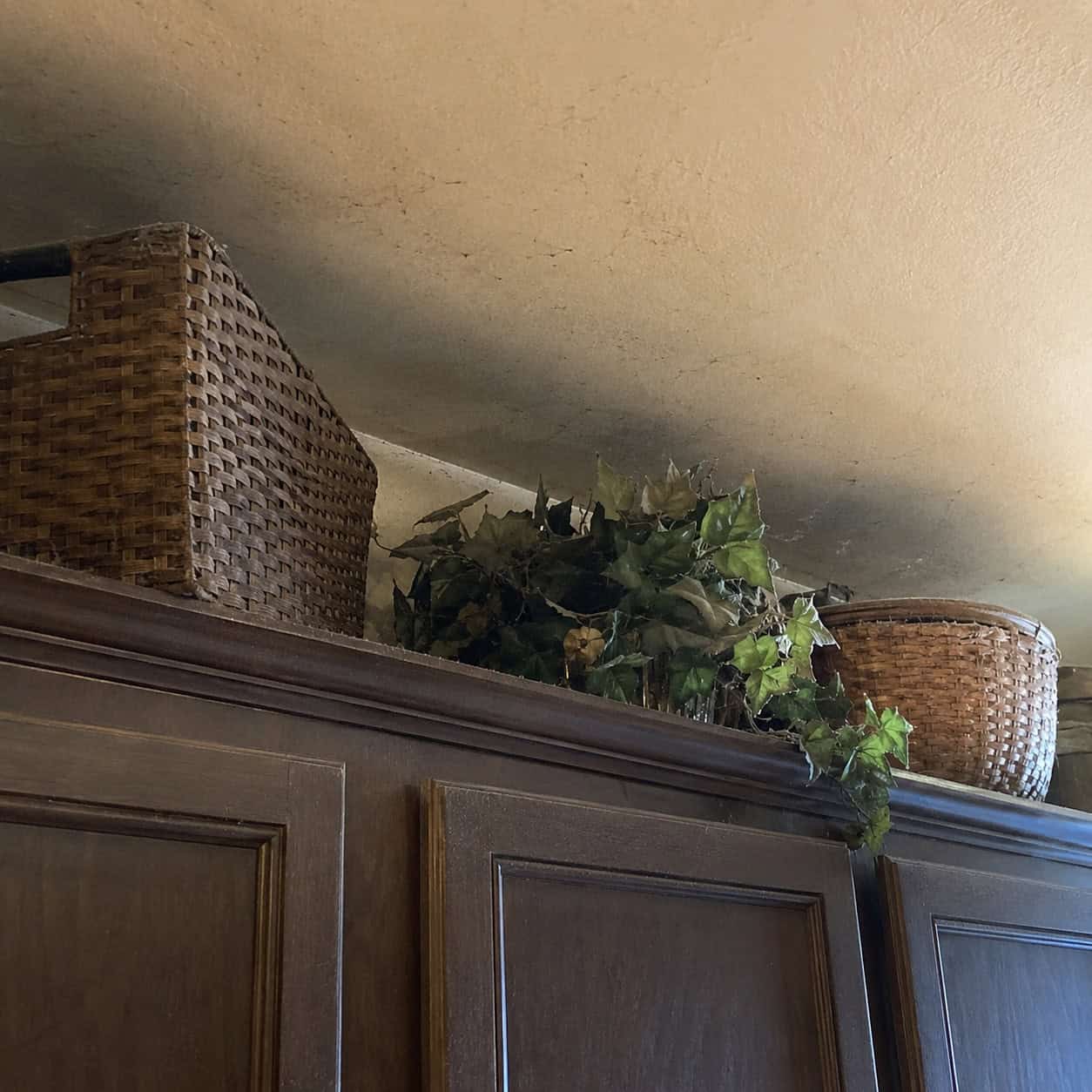
That open shelf of space between the upper cabinets and the ceiling. It was supposed to feel airy.
Instead it collects grease, dust, and whatever decorative baskets you gave up dusting years ago.
Running the cabinets all the way to the ceiling reads as more storage and a cleaner, more timeless line. No dead zone. No fuzzy layer on top of the fake ivy.
It’s one of those details that quietly separates a current kitchen from a tired one.
19. The Themed or Novelty Kitchen
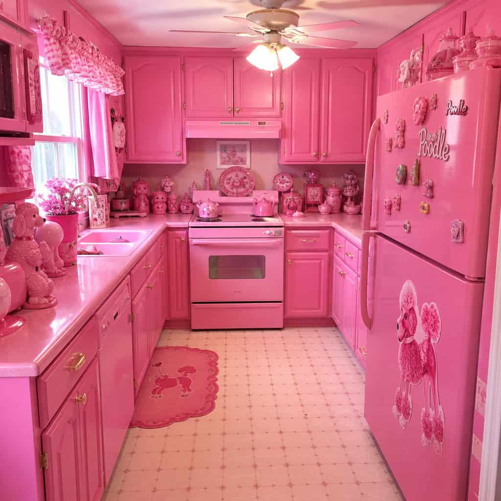
The all-pink Barbie kitchen. The full nautical galley. The one committed to a single, very loud idea.
Designers call heavy theming one of the biggest dangers in the whole trade — and they mean it.
You tire of it faster than you think. What felt playful on install day feels exhausting by year two.
And it wrecks resale. Buyers walk in, see a project instead of a kitchen, and mentally subtract the cost of gutting it. Have fun with paint and accessories you can swap. Keep the expensive bones neutral.
20. Faux-Finish and Textured Walls
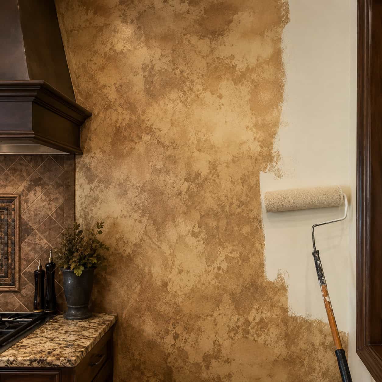
Sponged, ragged, troweled to look like an old plaster wall in a Tuscan farmhouse. The 2000s loved a faux finish.
They’re firmly on the way out now. Those busy, mottled walls date a room instantly.
Simplicity took over. A clean coat of flat paint reads calm and current.
This one’s a cheap fix, too — a weekend and a couple gallons of paint, or peel-and-stick if you want a pattern that comes right back off.
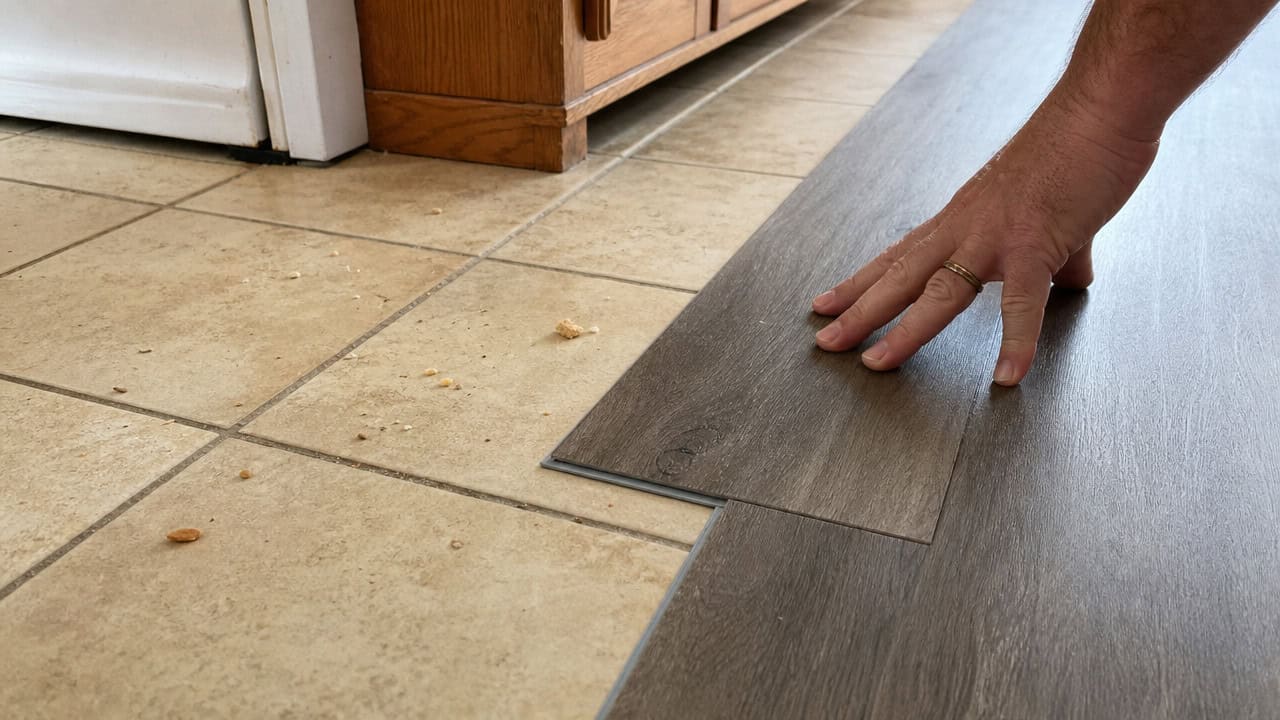
21. Builder-Grade Beige Tile Floors
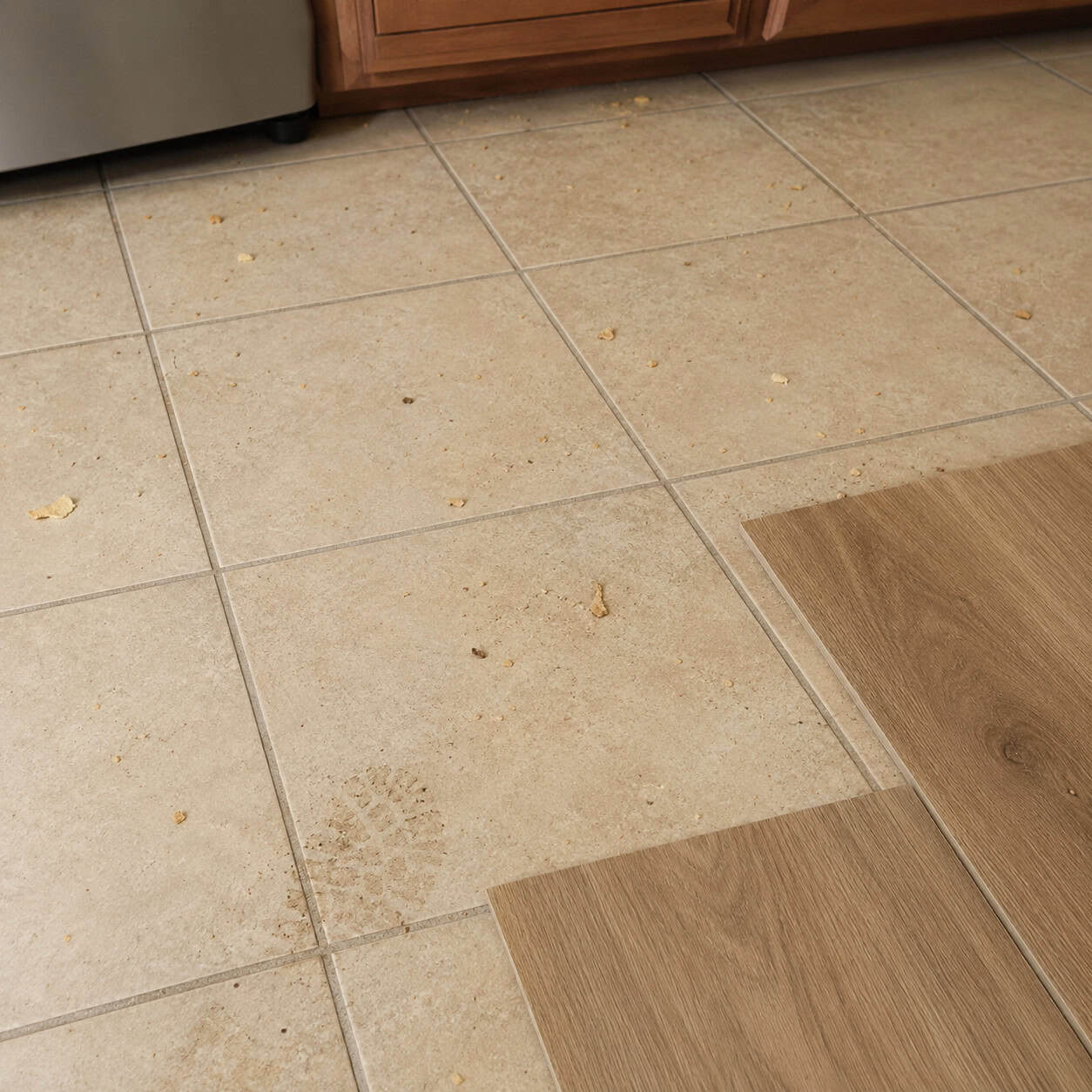
The default spec-home floor for two decades. Beige twelve-inch tile, beige grout, beige everything.
It looks cheap because it usually was. And it shows every crumb, every footprint, every dropped bit of pasta between mops.
Nothing dates a kitchen quite like that flat, builder-beige field of tile underfoot.
The easy remedy: luxury vinyl plank clicks right over the top of it. No demo, no dust, no dumpster — a low-cost regret with a genuinely simple fix.
22. Industrial Concrete Finishes
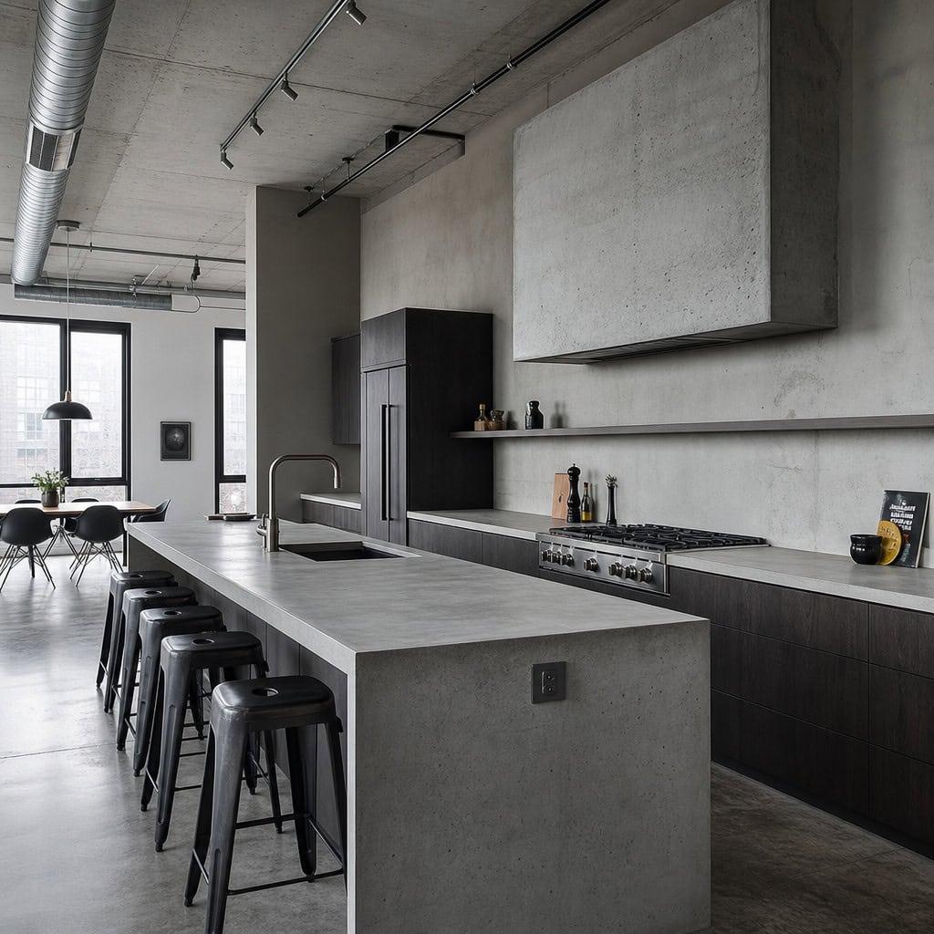
Concrete counters, concrete-look floors, a raw concrete hood. In a true converted loft with steel windows, it sings.
Everywhere else it feels cold. Clinical. Like a parking garage that learned to cook.
The rule designers keep repeating: match the finish to the actual architecture of your home. A 1990s colonial isn’t a warehouse, no matter how much concrete you pour into it.
Most homeowners who chased the industrial look outside a loft end up softening it back down within a few years.
23. Busy Speckled Granite
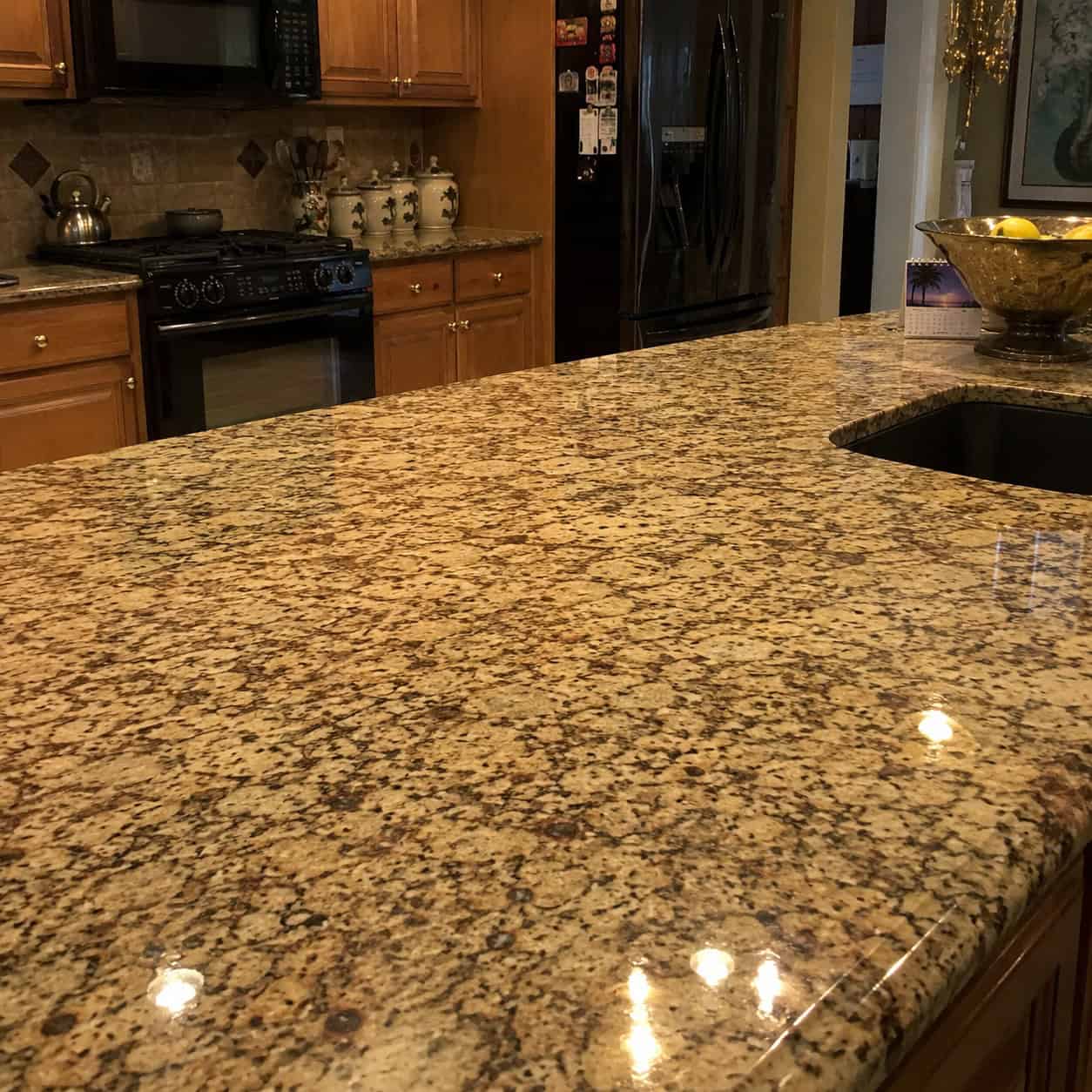
Granite itself isn’t the villain here. The pattern is.
Baltic Brown. Santa Cecilia. Venetian Gold. Those high-gloss, salt-and-pepper, cream-and-brown slabs defined the early-2000s kitchen — and they age worse than almost any surface on this list.
The problem is how busy they are. All that visual noise fights whatever else you put in the room, and the polished shine makes it worse.
Quieter stone is quietly coming back. Calmer slabs with soft, subtle veining look far more current than the speckled workhorses everyone installed twenty years ago.
24. Knocking Down Every Wall (Full Open-Concept)
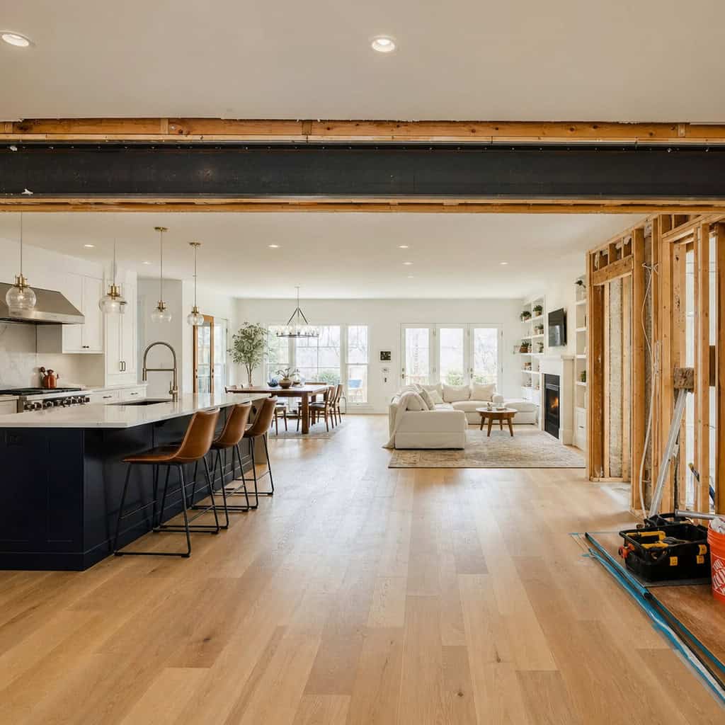
For twenty years the answer to every floor plan was the same: take the walls out. One giant great room, kitchen bleeding into dining bleeding into living.
Now it’s the most expensive regret on the list to reverse.
The pandemic changed the math. When the whole house is one room, cooking noise, dinner smells, and dirty-dish clutter broadcast to every corner. There’s nowhere quiet to take a call, do homework, or just close a door.
People want walls again. Contained work zones, a real pantry, a kitchen you can shut off from the rest of the house.
The trouble is the money runs both directions. Taking out a load-bearing wall in the first place meant a beam, an engineer, and often re-routing plumbing or electrical — easily $5,000 to $20,000 depending on the span and what was hiding inside it.
Putting a wall back isn’t cheap either. New framing, drywall, paint, flooring transitions, and any wiring you now want inside that wall. You pay thousands to open it up, then thousands more to close it back in.
Before you knock anything down, live in the space a while. A wall you can’t stand is far cheaper to remove than a wall you have to rebuild.
25. Single-Use Luxury Built-Ins
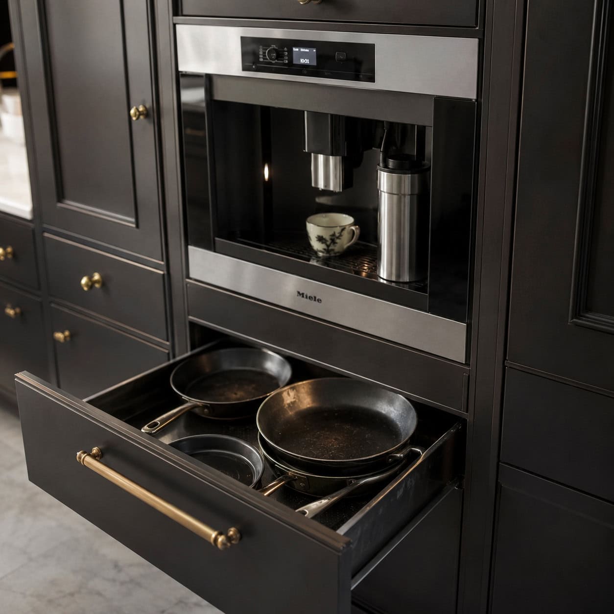
The built-in coffee machine plumbed into the wall. The warming drawer. The steam oven you swore you’d use.
Each one costs prime cabinet space and real money to serve a single, occasional function.
The built-in coffee machine is the classic. Thousands of dollars, and when it breaks you’re looking at a specialist and a hole in your cabinetry — while a $200 countertop machine does the same job and gets replaced in five minutes.
Owners are honest about it eventually. The warming drawer becomes a place to store pans. The steam oven gets used twice a year. Buy the appliance you’ll actually reach for daily and skip the showroom fantasy.
26. The Wine Fridge in the Island
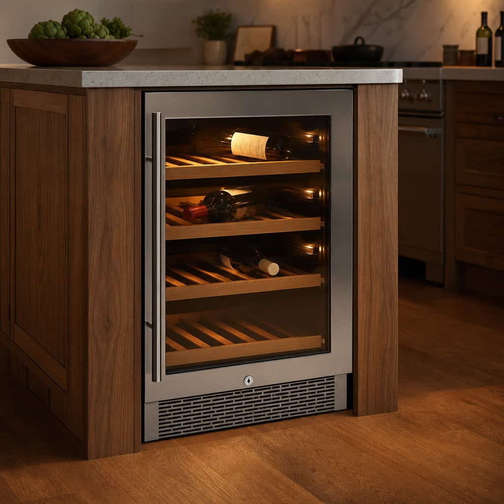
A little glass-front wine fridge tucked into the end of the island. Feels like a hotel bar.
It also eats a whole cabinet’s worth of storage in the most valuable spot in the kitchen.
Unless you entertain constantly, it sits half-empty and runs up your electric bill cooling a few bottles.
And it dates. A dedicated wine fridge in the island is one of those upgrades that felt essential in 2010 and feels like wasted space now. If you love wine, a freestanding unit off in the pantry does the job without stealing your best drawers.
27. High-Gloss Lacquered Cabinets
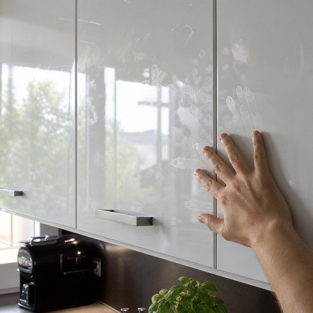
Those sleek European-modern fronts, mirror-shiny and seamless. They looked like the future in the 2010s.
They also show every fingerprint, every smudge, every water spot the second you touch them.
High gloss is a full-time cleaning job, and the look itself is fading as matte, honed, and natural-wood finishes take over.
Want sleek without the constant wiping? A satin or honed finish gives you the clean lines and none of the fingerprint parade.
The Takeaway
Almost every regret here started as somebody’s dream kitchen. That’s the trap — the trendiest choice always looks like the smartest one on install day.
The cheap regrets are forgiving. Paint, shelving, a floor you can float over the old one. Fix them on a weekend and move on.
The expensive ones — the stone, the walls, the plumbing — are the ones to slow down on. Those are the decisions worth being boring about.
Build the kitchen you’ll still like when the trend that sold it to you is long gone.
Thank you, I have learned a lot of things not to do.