

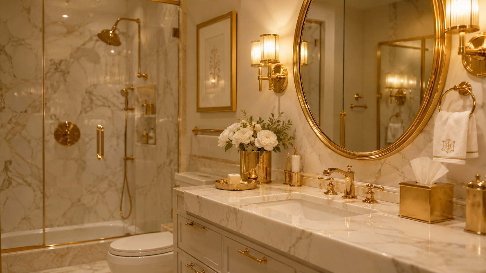
Walk into a bathroom remodeled around 2015 and you can date it in three seconds. Gray on gray on gray. A bronze faucet. A single amber bulb glowing over the sink like a dying campfire.
None of it was ugly at the time. It was aspirational. People spent real money chasing these looks, pulling ideas off Pinterest boards and HGTV marathons.
But trends age faster than tile. What read as “spa-like” and “custom” a decade ago now reads as a timestamp — a little frozen moment that tells every buyer, guest, and appraiser exactly when the room was last touched.
The good news? Most of these are easy fixes. Some cost a weekend and a bucket of paint. Others are worth folding into a bigger renovation.
Here are 26 bathroom choices that scream 2015 — and what designers are putting in their place.
1. Millennial Gray on Every Surface
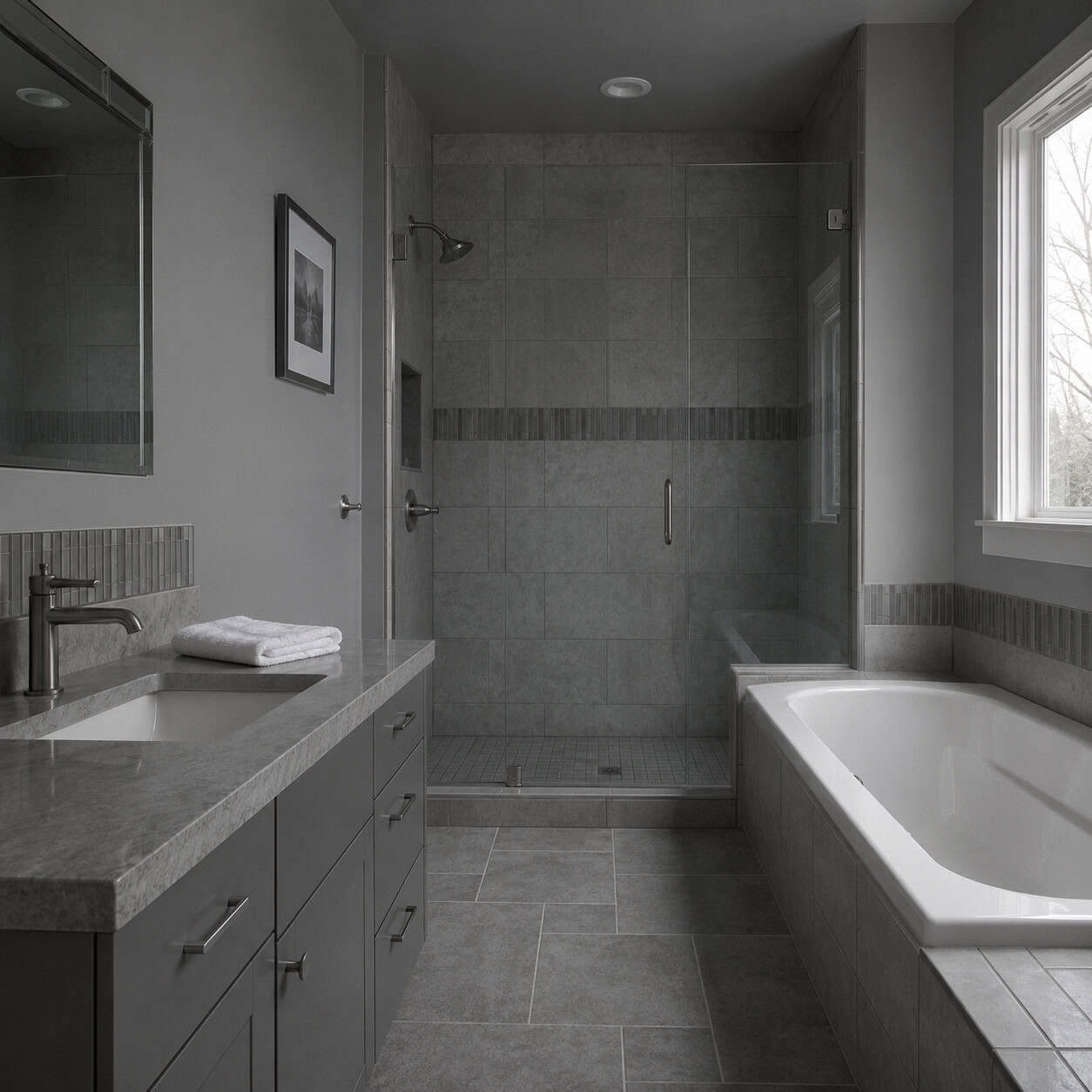
This is the loudest tell of them all.
Gray walls, gray tile, gray vanity, gray grout — the whole room dipped in the same cool, flat tone. It felt safe and modern in 2015. It felt like nothing could go wrong.
Now designers call it exactly what it became: cold and lifeless. A room with no warmth and no personality.
The replacement is warm and tonal. Think greige, soft clay, mushroom, and earthy taupe — layered shades instead of one flat gray blanket. According to Oakwood Remodel, warm and nature-inspired palettes are what’s pushing the all-gray scheme out.
Paint it and half the 2015 vibe disappears overnight.
2. Oil-Rubbed Bronze Fixtures
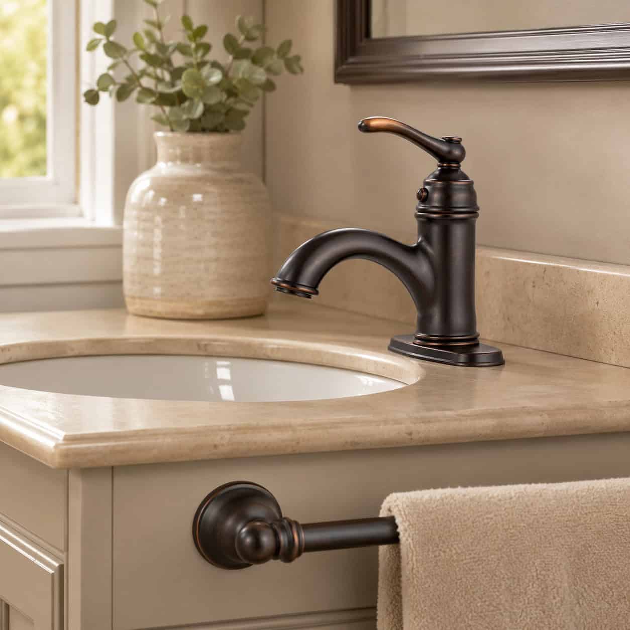
Every faucet, towel bar, and cabinet knob in that dark, coppery-brown finish. It was the default “transitional” choice — a deliberate rejection of shiny chrome.
For about five years it was everywhere. Now it’s a fingerprint of the early 2010s.
The finish itself hasn’t aged well either. It scratches, and the coating wears off oil-rubbed bronze over time, leaving splotchy bright spots.
Matte black took over. So did brushed nickel and champagne bronze. Any of the three reads current.
3. White Subway Tile, Brick-Laid
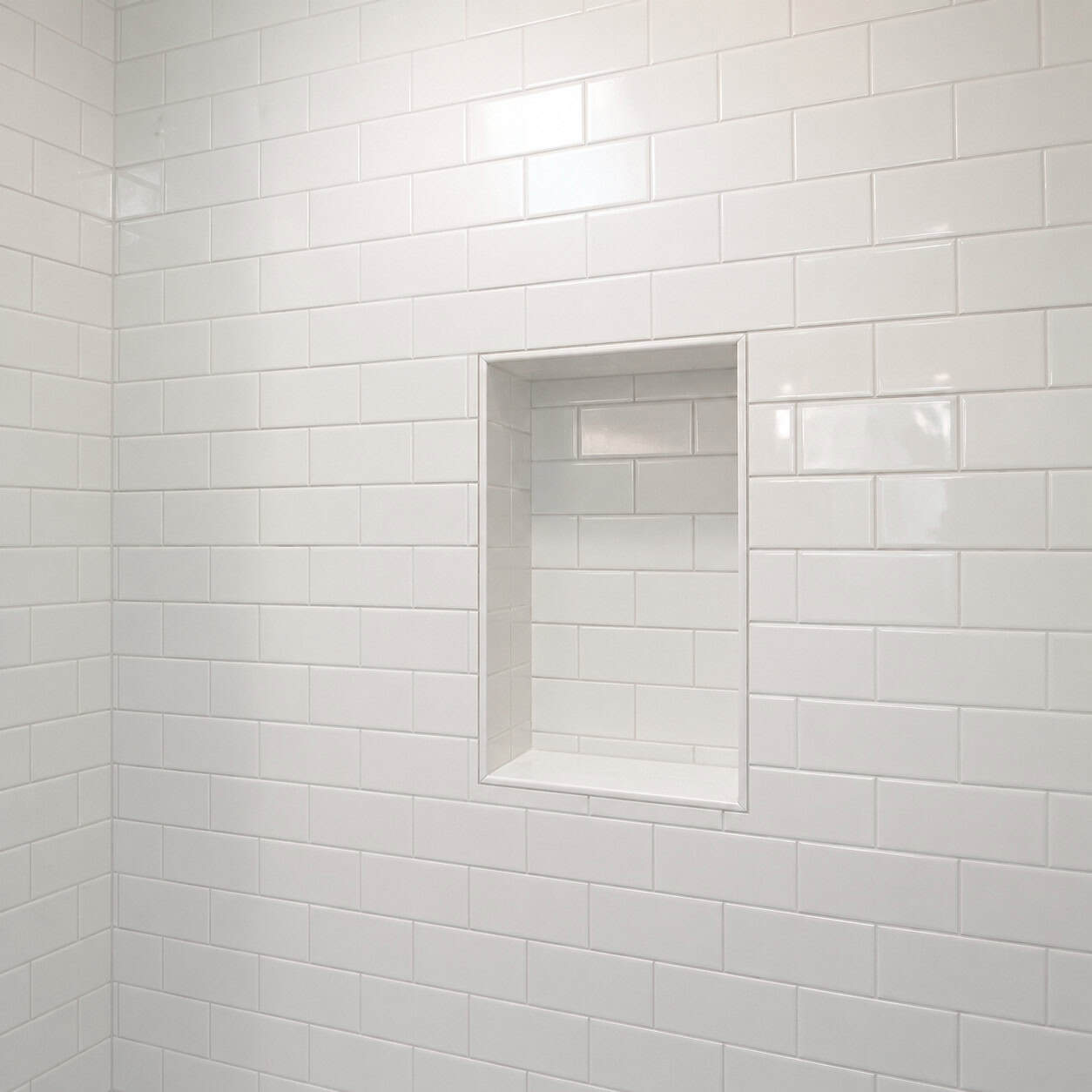
Houzz called it more popular than ever in 2015. That was the peak.
Plain white 3×6 tile, offset in the classic brick pattern, running up every wall. It was cheap, clean, and impossible to hate.
Now it’s the rental-flip cliche. The tile that says “we did the minimum.”
Zellige is the successor — handmade, glazed, slightly irregular tile that catches light. So is tone-on-tone grout, which softens the same subway layout into something quieter.
4. The Glass-Mosaic ‘Waterfall’ Accent Strip
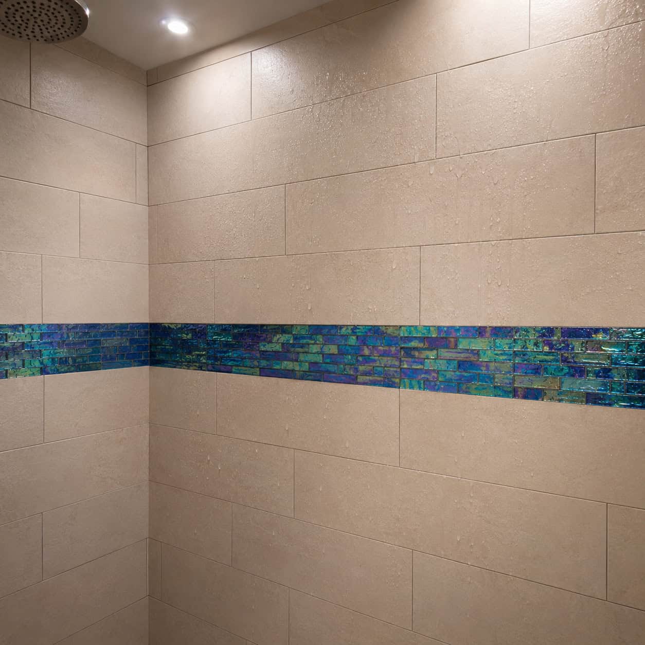
One horizontal band of iridescent glass mosaic, running through the shower tile at chest height.
It was the budget trick that made a beige surround look custom. A shimmery little belt on an otherwise plain wall.
Nothing dates a shower faster now. It’s the visual equivalent of a frosted tip.
Continuous large-format tile replaced it. Fewer grout lines, no gimmick, and the wall reads calmer top to bottom.
5. Vessel Sinks Perched on the Counter
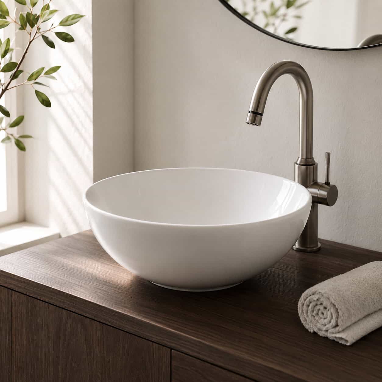
The bowl that sits on top of the vanity like a salad bowl left out on the counter.
It defined the “upscale powder room” of the era. Guests noticed it. That was the point.
But it splashes, it’s awkward to clean around, and the tall faucet needed to clear the rim always felt fussy. Outside of a Japandi or period bathroom, it now reads dated.
The undermount sink versus a drop-in is the calm default again, along with thin-rim integrated basins that sit flush with the counter.
6. The Frameless Rectangular Vanity Mirror
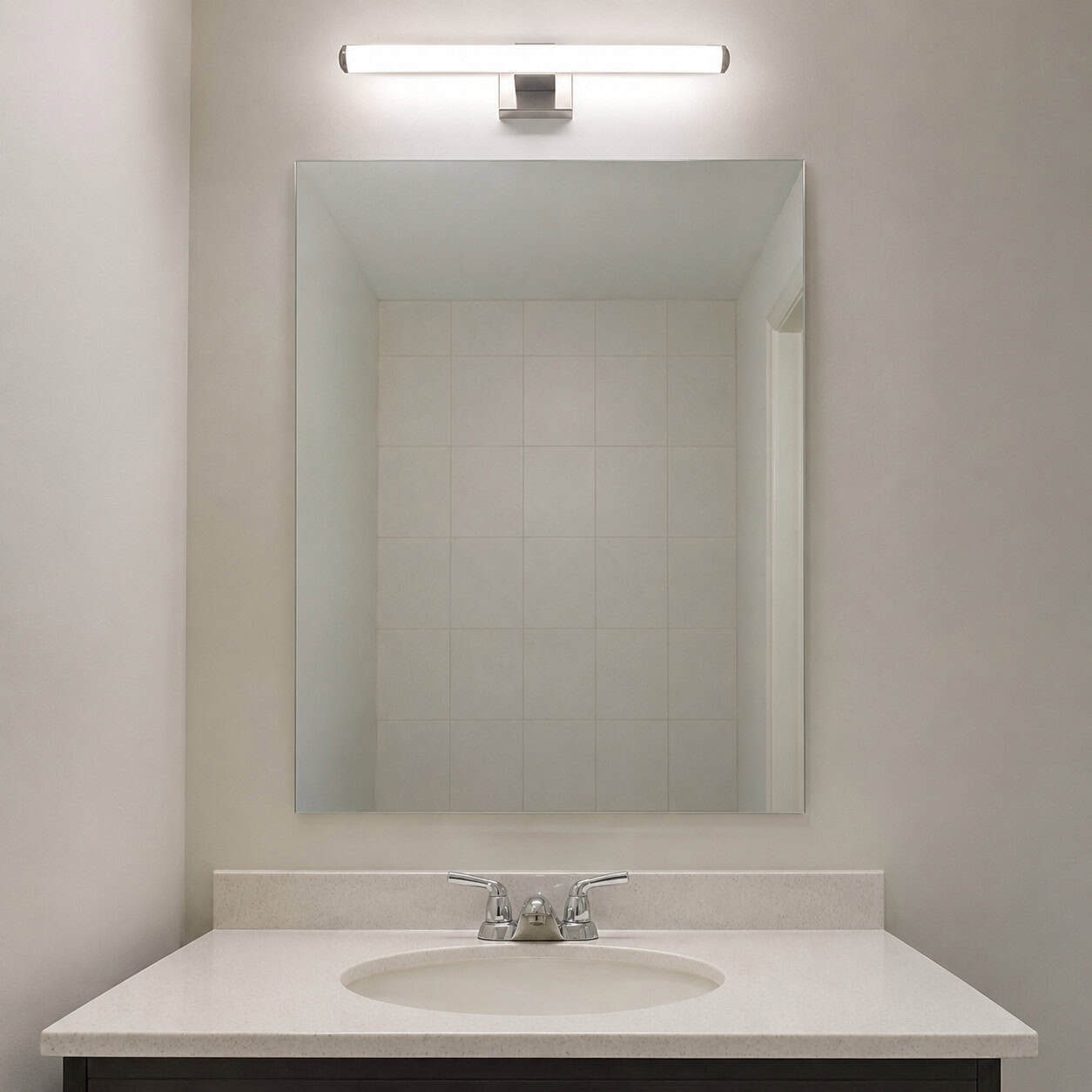
A plain rectangle of glass, no frame, centered over the sink. One overhead fixture. Done.
It was builder-grade for decades and nobody questioned it. Cheap, functional, invisible.
Invisible is the problem. It adds nothing.
Framed mirrors, round mirrors, and vintage-look pieces are what designers reach for now. A framed round mirror over a vanity does more for a room than most people expect.
7. Exposed Edison-Bulb Fixtures
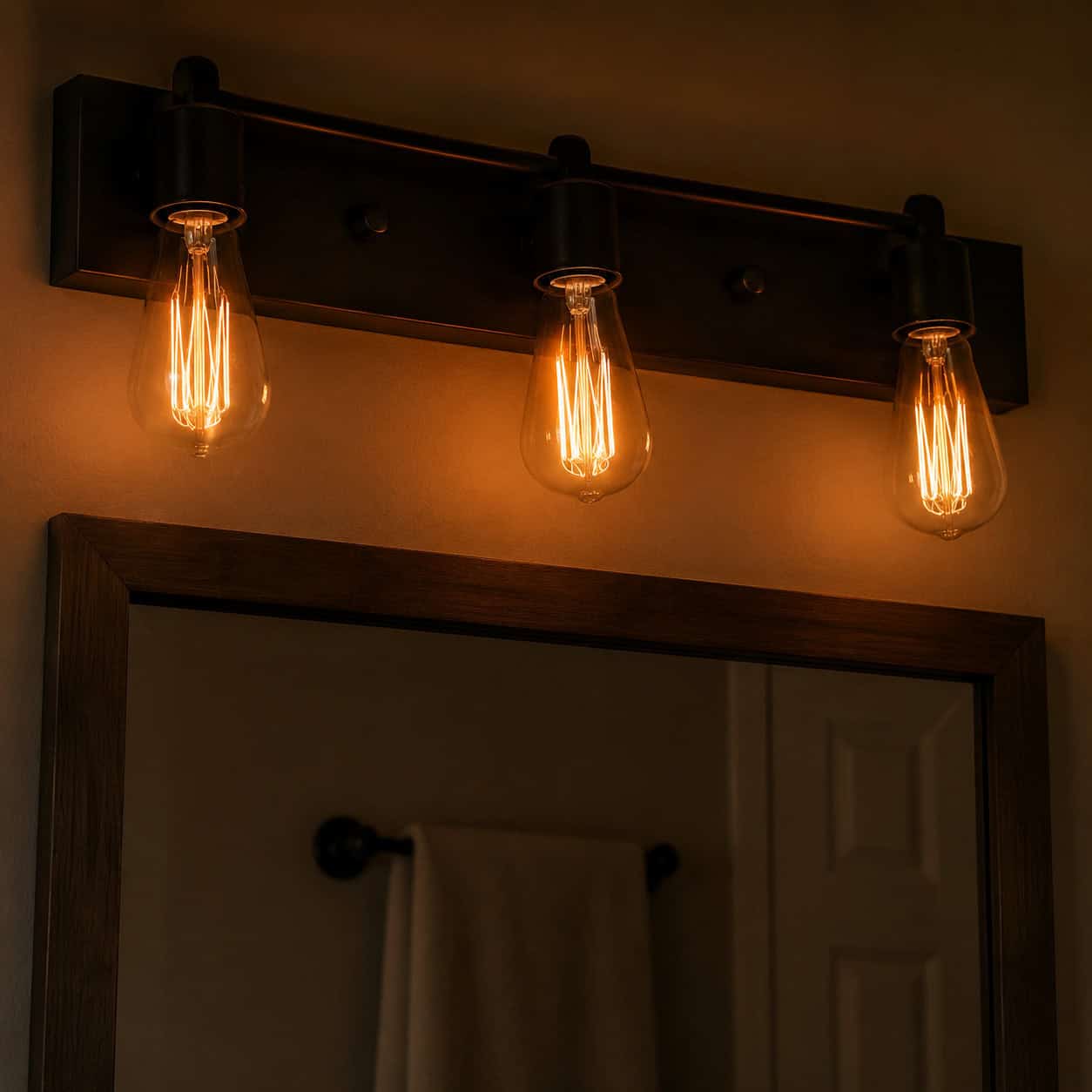
The naked amber filament bulb escaped the gastropub and landed on vanity bars everywhere around 2014.
It looked warm and clever. For a minute.
Then everyone realized it was too dim to actually see your face — a real problem in the one room where you’re supposed to see your face. And the glare of a bare bulb at eye level is unforgiving.
LED decorative-filament bulbs keep the look with real light output. Better yet, clean sconces flanking the mirror. Hunker flagged the bare Edison bulb as one of the quickest lighting swaps to modernize a space.
8. The Sliding Barn Door
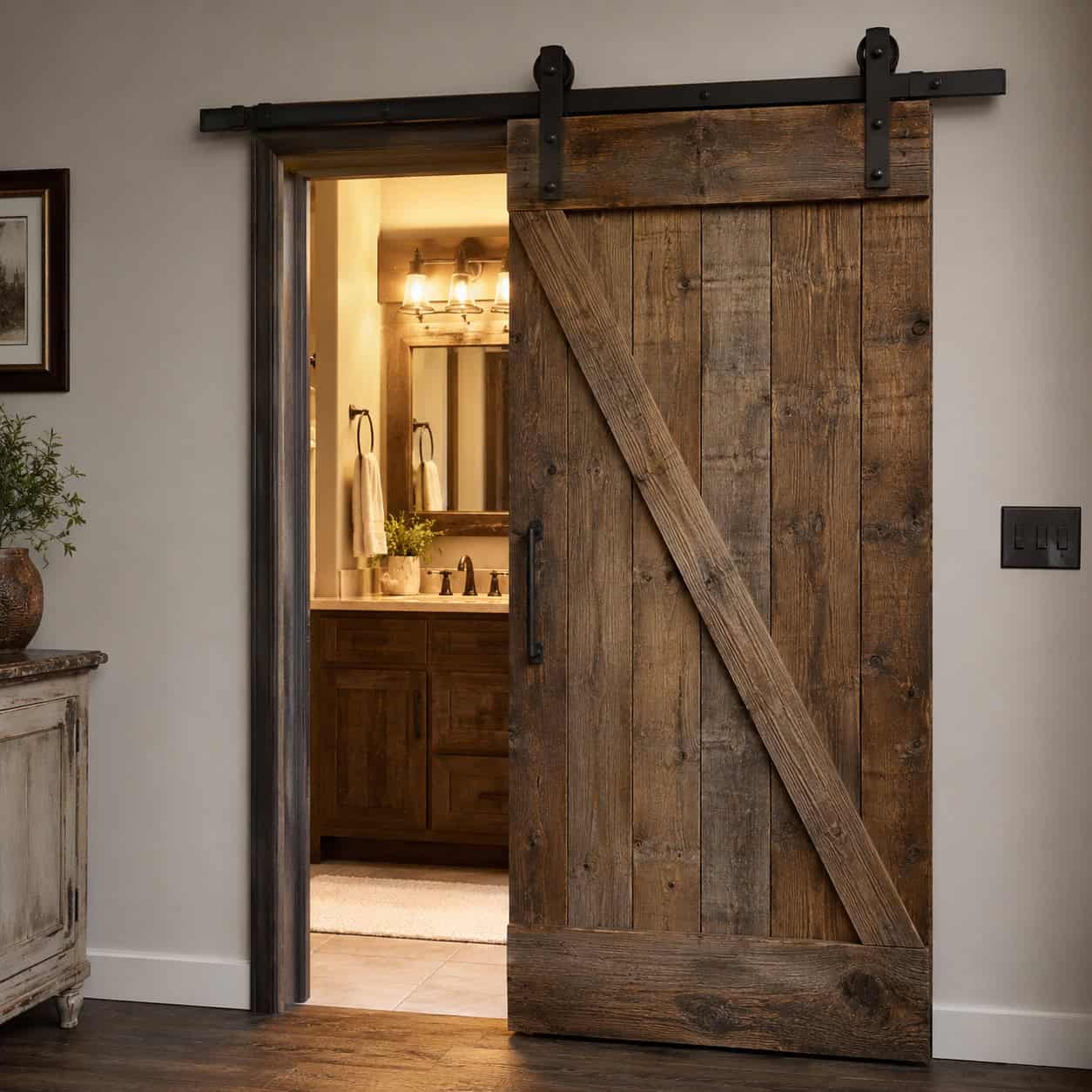
Blame Fixer Upper.
The rustic rolling door on a barn track showed up on bathrooms between roughly 2013 and 2018, and it became one of the loudest markers of that whole modern-farmhouse phase.
It also doesn’t seal. Sound and light leak around the edges, which is less than ideal for a bathroom.
Pocket doors are the quiet, space-saving replacement. If a swinging door won’t work, a pocket door disappears into the wall without the rustic baggage.
9. Shiplap Accent Walls
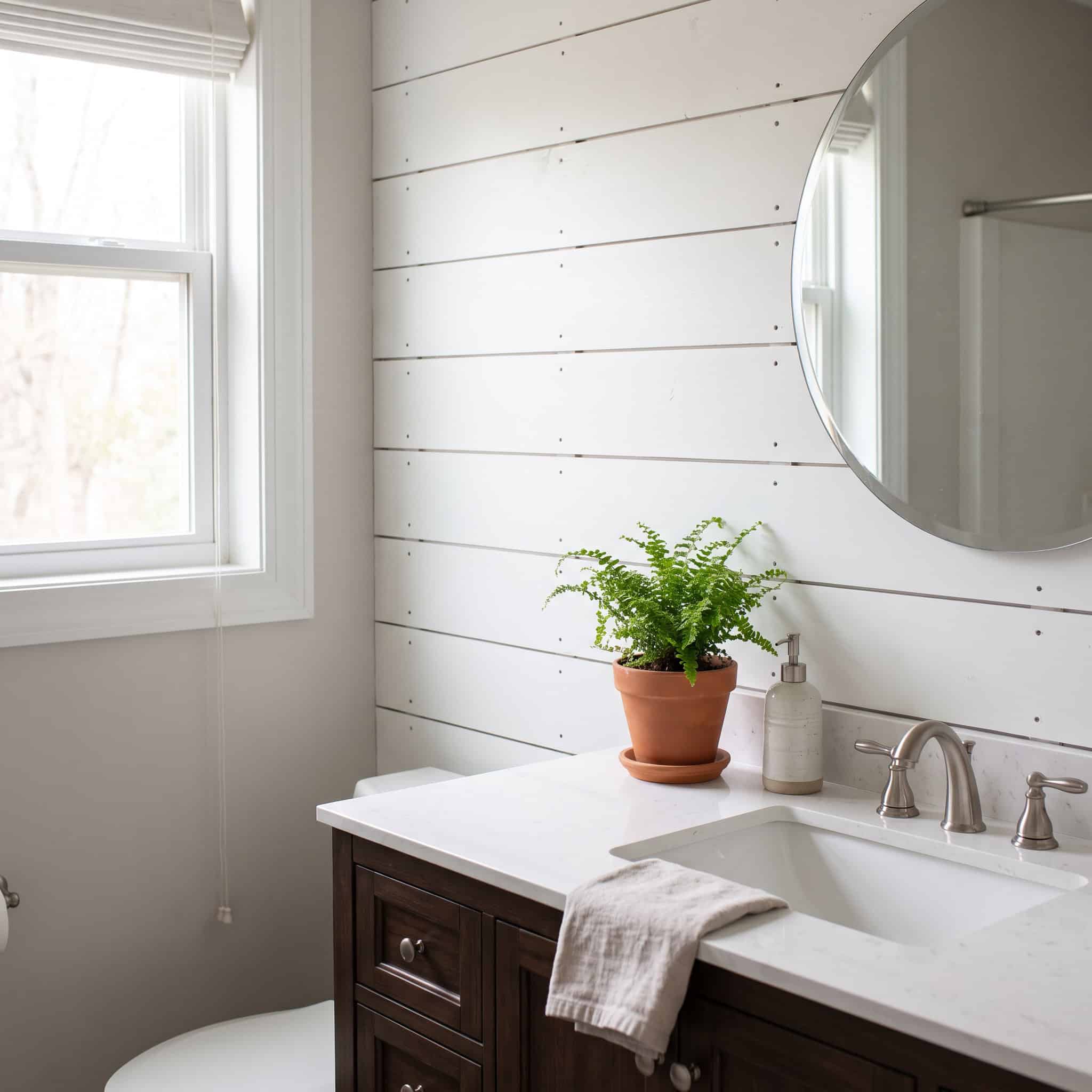
Joanna Gaines made horizontal plank shiplap the texture of the decade.
It went on accent walls, behind vanities, up to the ceiling. For a while it was shorthand for “we renovated.”
Now it’s shorthand for “we renovated in 2016.”
Updated farmhouse leans on color and smoother materials instead of that one busy texture. House Digest notes that even the style’s originators have moved toward sleeker, less literal versions of the look.
10. Mason Jars, Wire Baskets & ‘Wash Your Hands’ Signs
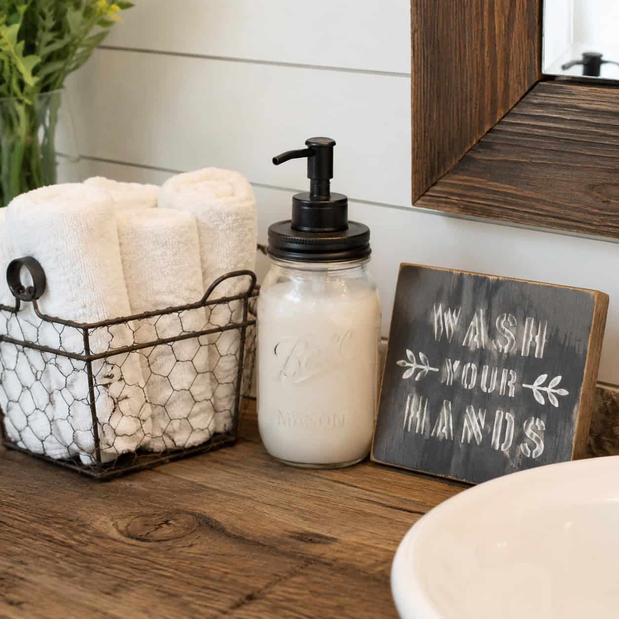
The mason-jar soap pump. The galvanized wire basket of rolled towels. The stenciled wooden sign reminding you to wash your hands.
Shabby-chic farmhouse styling, all of it. Cute in 2016.
Now it reads gimmicky and a little cluttered.
Designers push organic materials and real greenery instead — a stone tray, a wood stool, a plant that’s actually alive. Less signage, more substance.
11. The Stark All-White Spa Bathroom

White tile, white vanity, white counters, white everything. In 2015 it read as clean, expensive, and hotel-like.
A decade later the same room reads cold and sterile. Like a hospital wing with a nicer faucet.
The fix isn’t to throw out white — it’s to warm it. Add wood tones, natural stone, a warm metal, a bit of color. Personality.
White as a base is fine. White as the entire personality is what aged.
12. The Jacuzzi / Whirlpool Jetted Tub
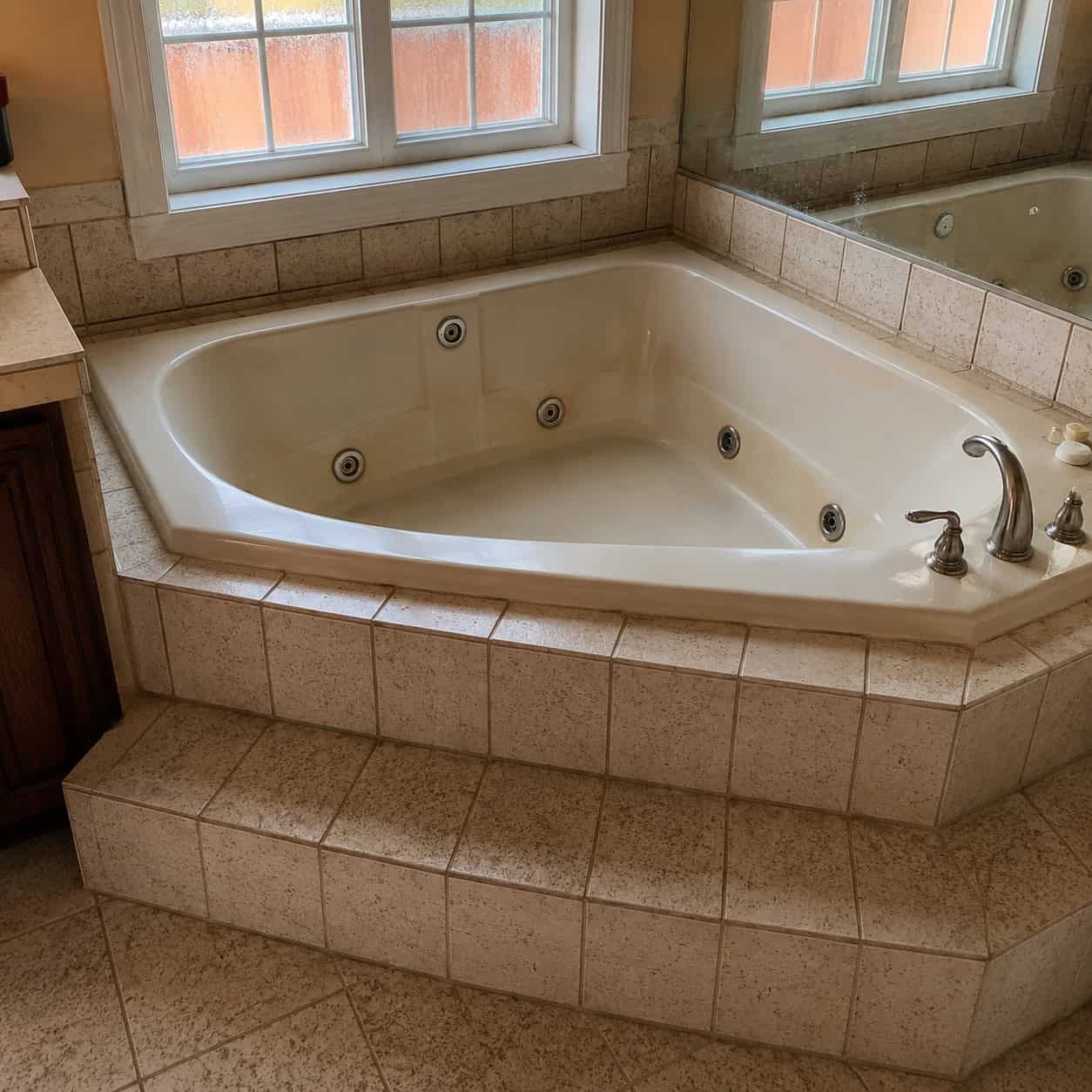
In 2015, the jetted corner tub was still the crown jewel of the home spa. Big triangular deck, a wall of jets, a step-up surround in speckled tile. If your bathroom had one, it was the luxury bathroom.
Almost nobody uses them.
They take forever to fill, they hog a huge footprint, and the jet lines trap water and grow biofilm you can never fully flush out. Run the jets after a few months idle and you’ll see what comes out. It’s not spa water.
They’re also water hogs at a time when efficiency actually sells a house.
So what replaces it? Two things, depending on your space.
- A clean freestanding or minimalist soaking tub if you genuinely take baths
- A large curbless walk-in shower if you don’t
Be honest about which one you are. Most people who tore out a jetted tub for a big walk-in shower never looked back — the shower gets used daily, the tub got used twice a year.
If you love a soak, a deep freestanding tub gives you the ritual without the plumbing that grows things. If you’re on the fence about giving up a tub entirely, it’s worth reading up on whether bathtubs are actually outdated before you commit. And if you’re weighing a soaking tub against a jetted one, the bathtub versus Jacuzzi difference comes down to exactly the maintenance headache above.
Reclaiming that corner for a proper shower is one of the highest-impact swaps in this whole list.
13. Chevron & Herringbone Tile Patterns
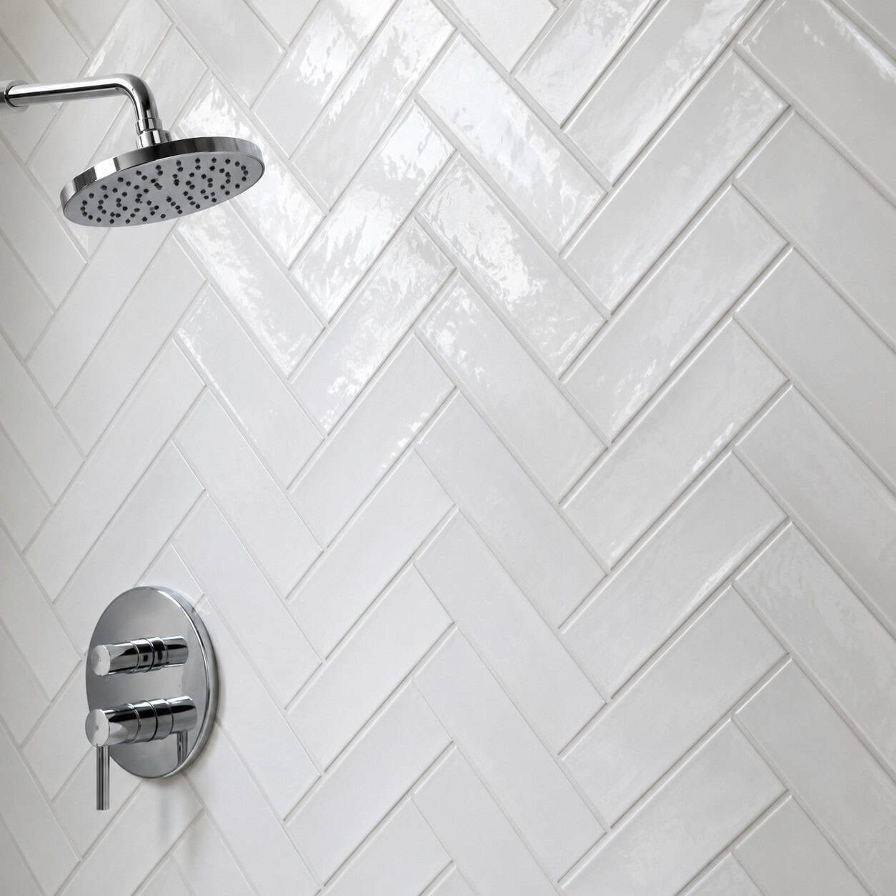
Around 2015 and 2016, laying plain tile in a herringbone or basket-weave pattern was how you made it “dramatic.”
The pattern did the work the tile couldn’t.
Now that busy zigzag dates a space instantly. All those angles fighting for attention.
Tonal, continuous surfaces are in. A single large-format tile laid straight reads far more current than any clever angle.
14. Wood-Look Plank Porcelain Tile
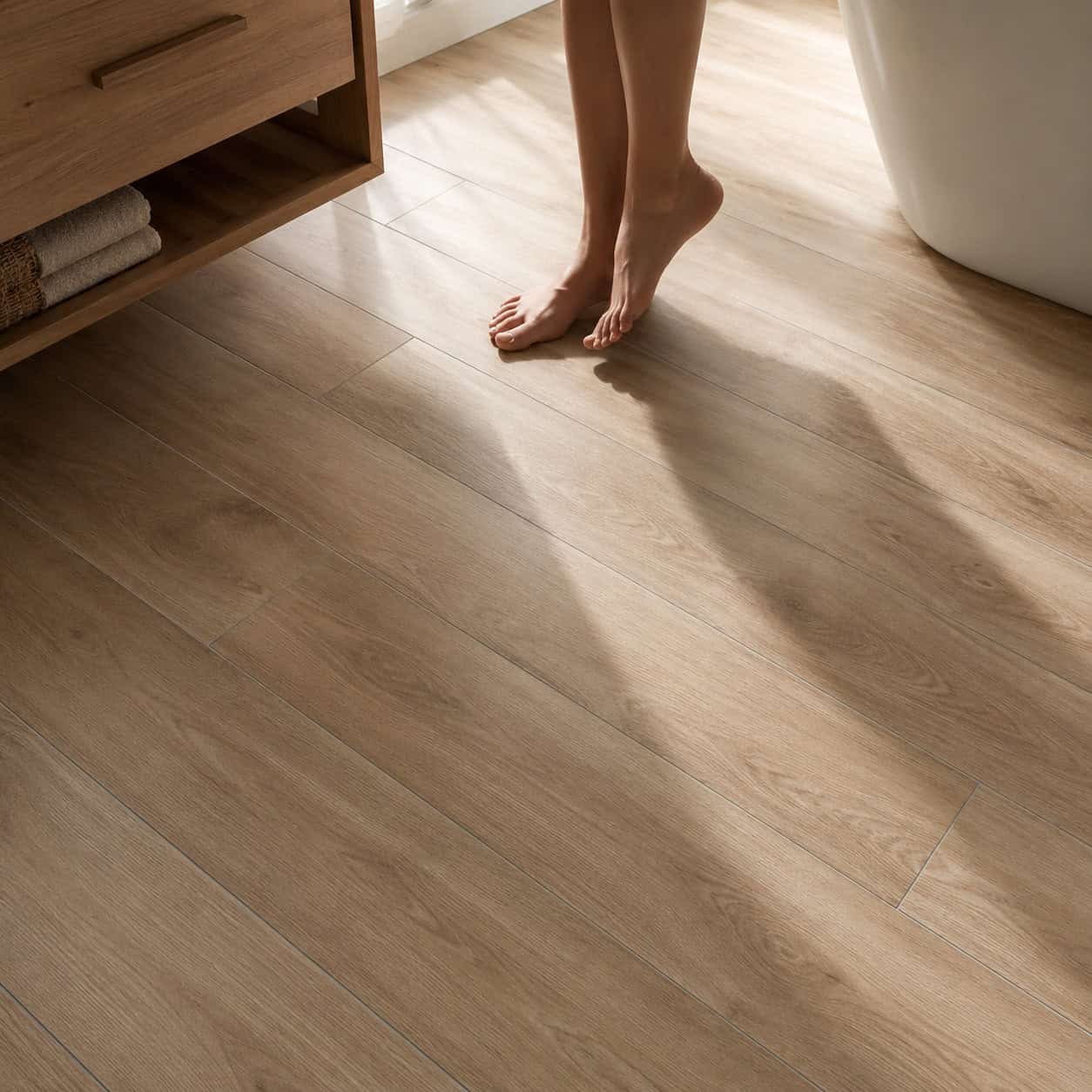
Porcelain planks printed to look like hardwood were a headline 2015 flooring pick. Waterproof wood — what’s not to love?
The problem is it never quite convinced anyone.
Up close, the repeating print gives it away, and the grout lines between “boards” break the illusion completely. Forbes flagged the faux-wood look as one of the trends going out of style.
Natural stone, real wood in the right spots, and cement tile are the moves now. If you want warmth underfoot, warmth that reads real beats a printed imitation.
15. Thick, Dark Contrasting Grout Lines
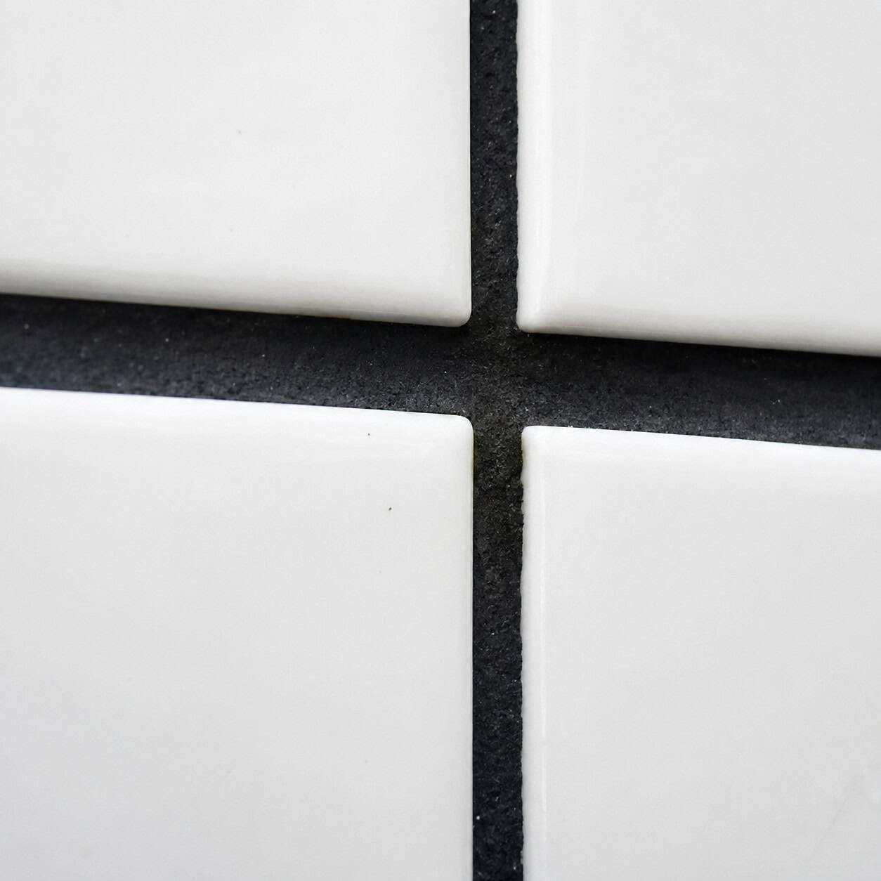
White tile with bold dark grout was the era’s cheap drama. It made the tile “pop.” Every flip did it.
Now it reads exactly like a flip. The grid becomes the loudest thing in the room.
The current look is the opposite: fine grout lines, color-matched to the tile, for a seamless surface where the tile reads as one continuous plane.
Here’s the practical part, because grout is where bathrooms go to die. Dark grout was partly a maintenance dodge — it hid mildew and soap scum that white grout shows immediately. So before you rip anything out, decide whether you’re dealing with a style problem or a mold problem.
If the grout is just dark by choice and structurally fine, you have two paths. You can regrout — grind out the old color and refill with a matched shade, a doable weekend job on a small area. Or you can use a grout colorant to recoat the existing lines, which is cheaper but wears at the edges.
If the grout is dark because it’s harboring mildew, cleaning comes first. A few of these bathroom cleaning tips that actually work will tell you fast whether it scrubs clean or whether the mold has gone deep into the joints.
Watch for these before deciding to regrout versus replace:
- Grout that stays dark in patches even after a deep scrub
- A persistent musty smell near the shower floor
- Soft or crumbling grout you can dig out with a fingernail
- Loose or hollow-sounding tiles
If it’s just surface grime, clean and recolor. If the tile is loose and the grout crumbles, water is already behind the wall — that’s a tear-out, not a touch-up.
16. Industrial Pipe Open Shelving
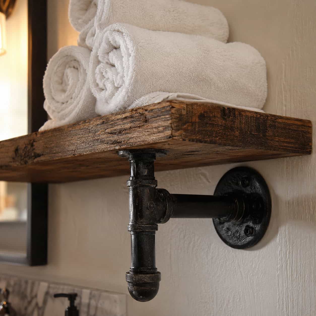
Black galvanized-pipe brackets holding a reclaimed-wood plank, stacked with rolled towels. Peak industrial-chic, roughly 2014 to 2017.
It looked rugged and intentional. It also collects dust on every horizontal surface and every pipe fitting.
Open shelving in a bathroom means everything on it lives in a fog of humidity and lint.
Concealed storage and floating vanities replaced it. A closed cabinet keeps the towels dry and the room quiet.
17. Pebble-Tile Shower Floors
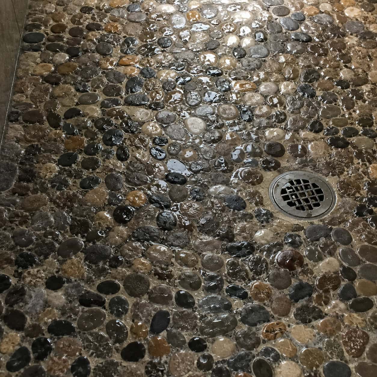
River rock underfoot promised a natural, spa-like massage every morning. It photographed beautifully.
Living with it is another story.
All those rounded stones mean an enormous amount of grout — far more surface area than flat tile — and every one of those crevices catches soap, hair, and moisture. It’s a mold and mildew factory that’s genuinely hard to clean, and the uneven surface can be uncomfortable to stand on.
Sealing helps, but you have to reseal it regularly, and most people don’t. Within a couple of years the grout between the pebbles darkens and stays that way.
The replacement is large-format porcelain or a single continuous tile with a slip-resistant finish. Fewer grout lines means less to scrub and far less for mildew to grab onto. If you want texture for grip, small square mosaic on the floor gives you traction with a fraction of the crevices.
If you’re keeping a pebble floor for now, the least you can do is keep it draining fast — a clogged pebble floor holds standing water, which is the whole problem multiplied. Staying on top of getting hair out of the shower drain buys you time until you’re ready to retile.
18. The Waterfall-Edge Vanity Countertop
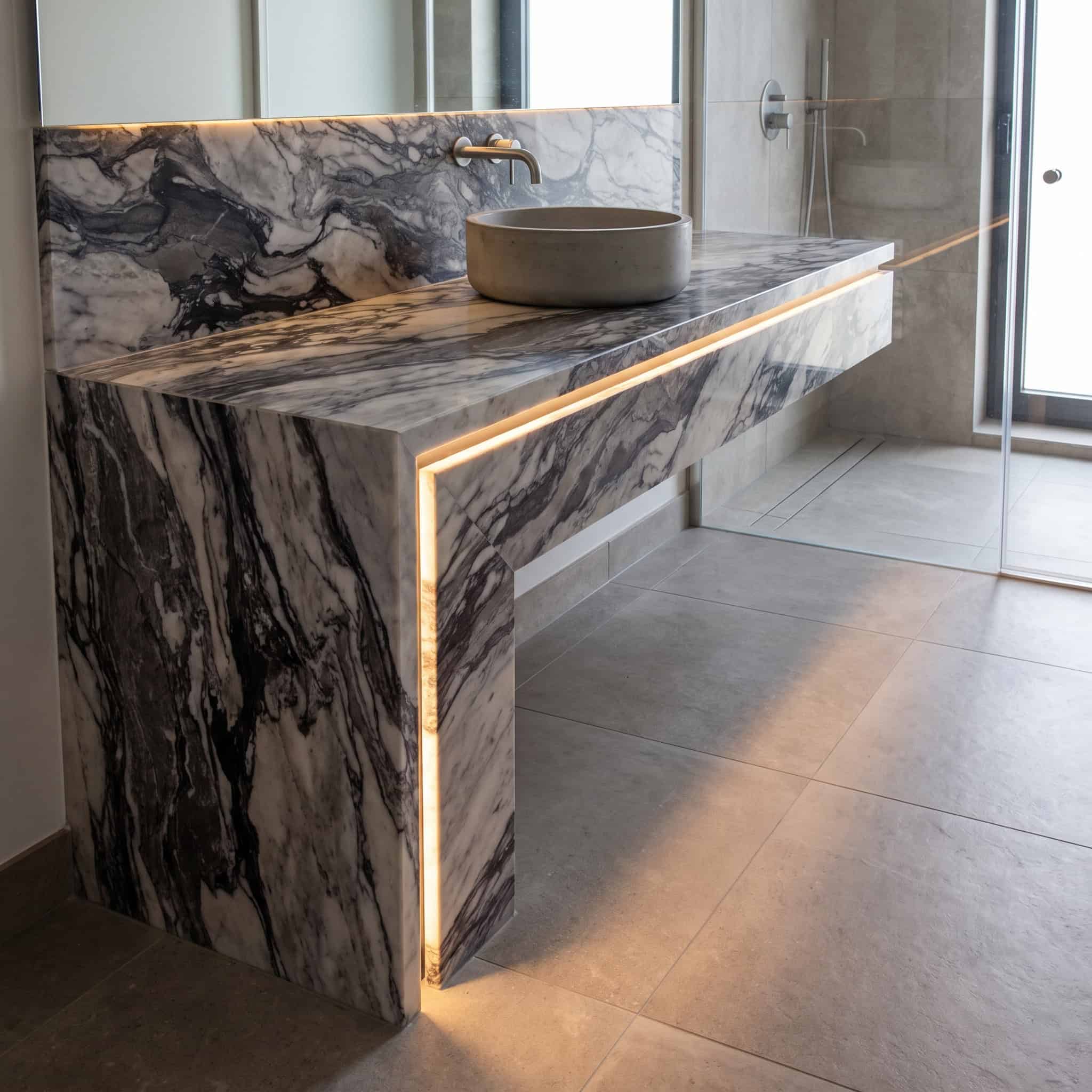
Stone that cascades vertically down the sides of the vanity, so the counter looks like it’s pouring onto the floor. Often paired with a strip of light glowing underneath.
It was a marquee 2015 luxe move. Very of-its-moment.
That’s the trouble — it’s so tied to a specific era that it can’t read as timeless.
A standard countertop with a clean edge profile has come back around. Let the stone be beautiful without the theatrics.
19. Granite Vanity Countertops
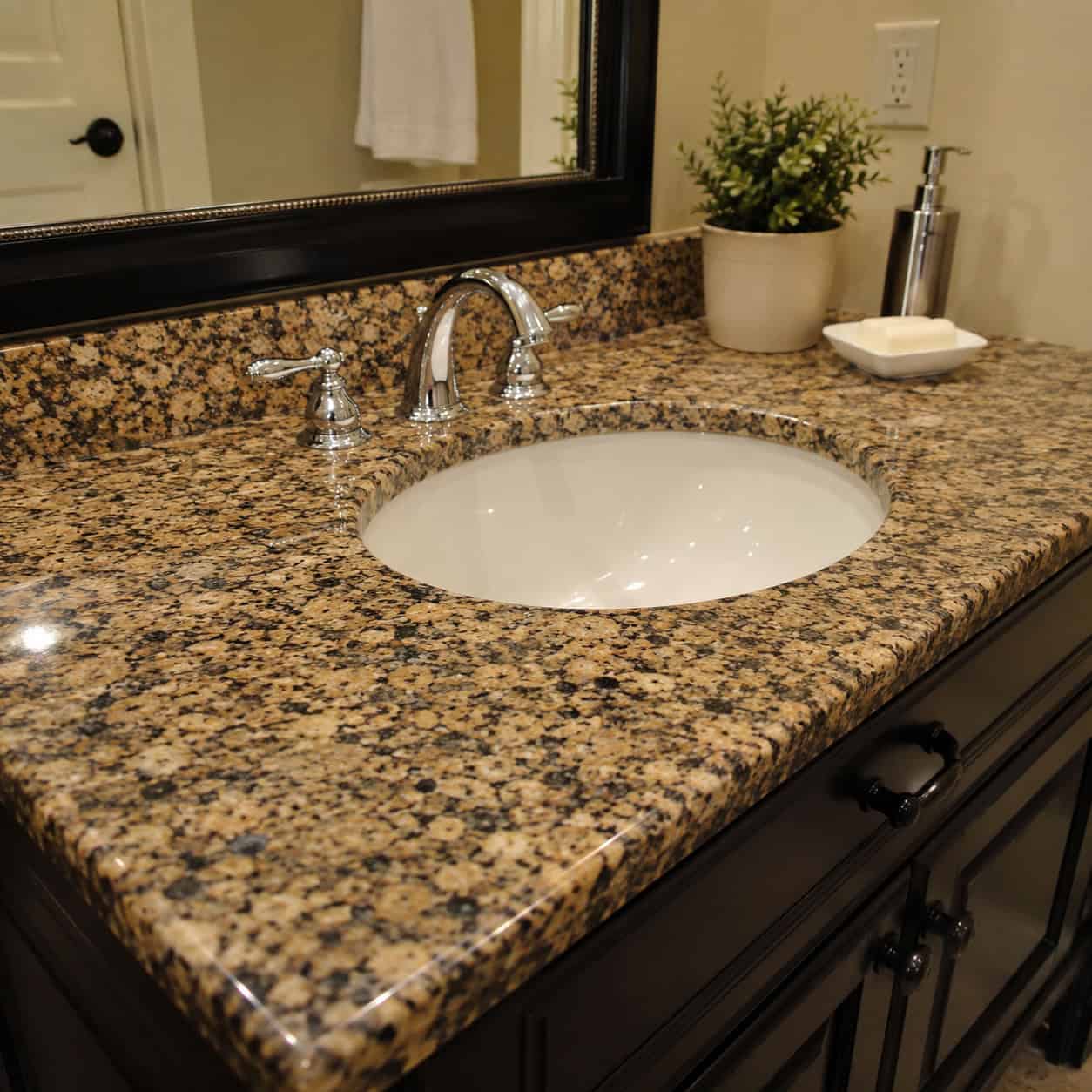
Speckled granite was still the default vanity top in 2015, even as quartz was already gaining on it.
The busy multi-tone speckle is the giveaway now. It fights with everything.
Quartz won for practical reasons — it resists moisture and stains without sealing, which matters in a bathroom. Warm marble and quieter engineered slabs have taken the high end.
If you’re keeping granite elsewhere, at least clean it right — the wrong cleaner strips the seal, so knowing what to clean a granite countertop with keeps it looking its age instead of older.
20. The Trough Sink With Two Faucets
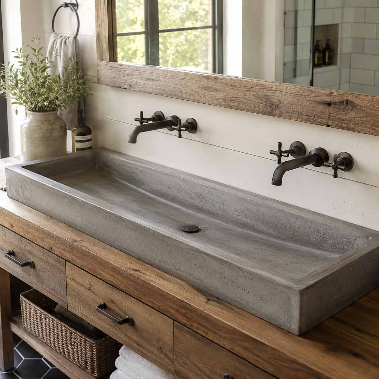
One long single basin, two faucets mounted over it. A farmhouse-industrial statement that felt fresh mid-decade.
It made a bold visual point. It also made brushing your teeth next to someone weirdly communal.
As the whole industrial-farmhouse look fades, the trough goes with it.
Twin undermount sinks are the calmer replacement. Two real basins, two faucets, none of the barnyard association.
21. Dark Espresso ‘Furniture-Style’ Vanities
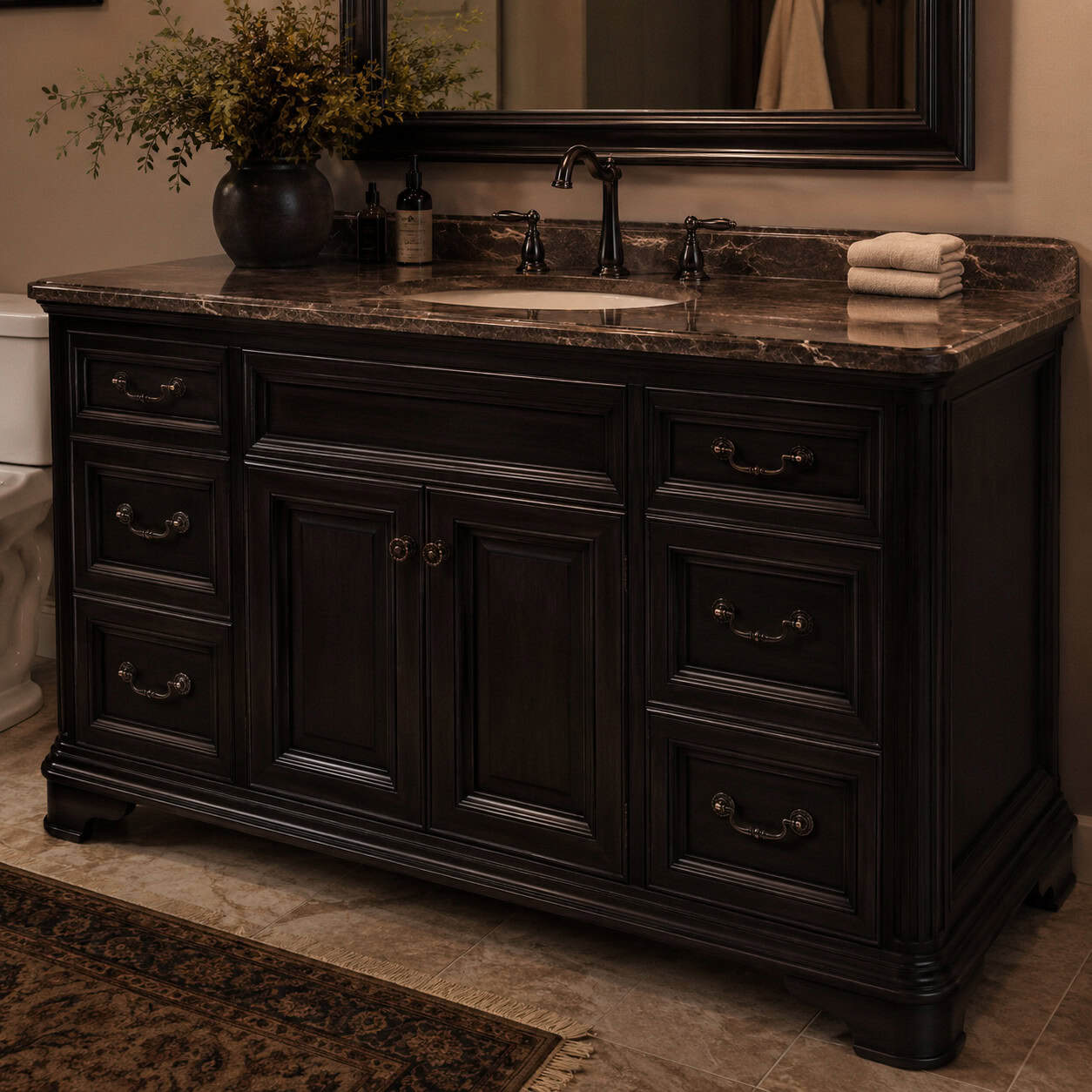
Heavy, dark-stained vanities dressed up like antique furniture, loaded with ornate bronze pulls. The transitional-to-Tuscan default.
They made rooms feel smaller and darker than they needed to.
Now it reads decisively dated — the espresso stain especially.
Painted shaker vanities took over: warm white, putty, sage, or a soft blue-green. Lighter, simpler, and they make a small bathroom breathe.
22. Loud Moroccan & Encaustic Cement Floor Tile
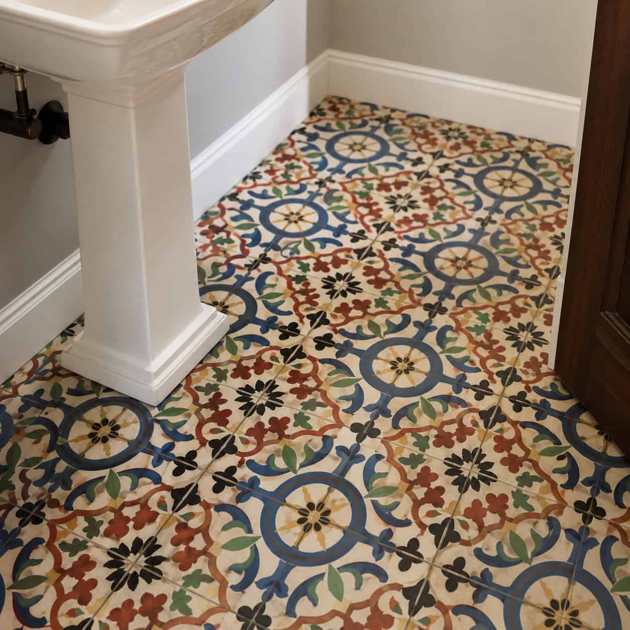
Vibrant, multi-color cement tile jumped from Mediterranean homes into every powder room around 2015. The busier the better, or so it seemed.
A bold patterned floor is a big commitment. And the loud multi-color versions now read as very of-their-moment.
Calmer patterns came back — classic checkerboard, tonal geometrics, black-and-white. Pattern with restraint instead of a color explosion.
A patterned floor can still work. It just can’t shout.
23. Oversized Rain Showerhead
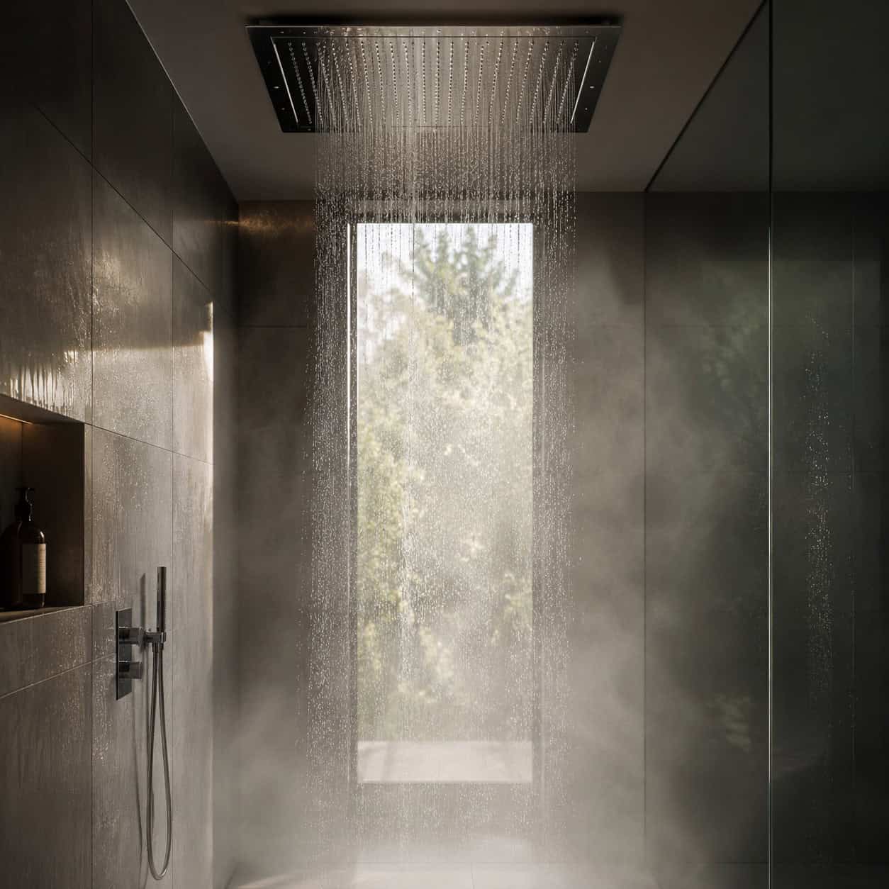
The giant ceiling-mounted rainfall head was the era’s go-to spa upgrade. Industry sources flagged it cresting even back in 2015.
The reality underwhelmed a lot of people. A pure overhead rain head has soft pressure and no way to avoid the water — try washing your hair without getting your face soaked.
The current setup pairs a fixed head with a handheld on a slide bar, so you get rainfall and control. If you’re keeping the big head, at least dial in the best placement for a rain shower head so it actually lands where you stand.
24. Glass Block Windows
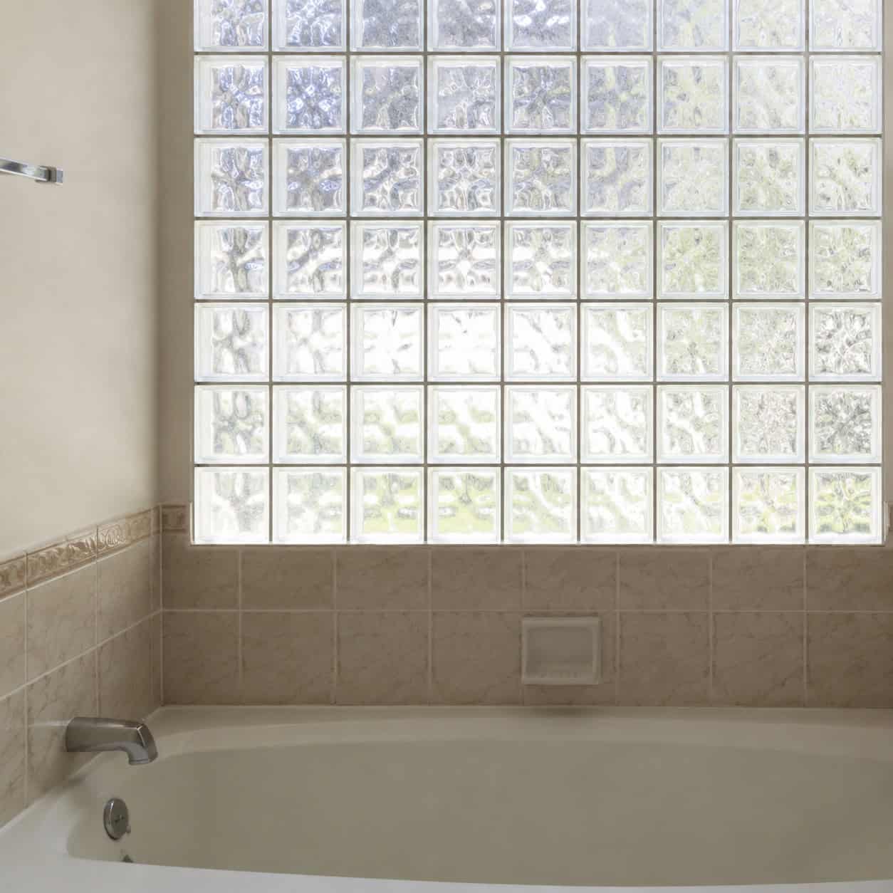
Really an ’80s and ’90s feature, but plenty survived into 2015 remodels — that chunky wall of frosted glass cubes over the tub.
It let light in without a clear view out. A reasonable idea, executed in the bulkiest way possible.
Now it reads heavy and dated, and it blocks more light than a good modern solution would.
Frameless frosted glass, obscured window film, or a slim privacy panel do the same job without the ’90s bulk.
25. Pedestal Sinks
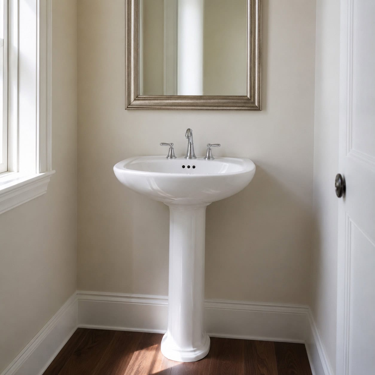
Common through the 2010s, and genuinely elegant in the right small bathroom. The slim profile fits where a vanity can’t.
The knock is storage — there’s zero of it. Every toothbrush and bottle has to live somewhere else.
This one’s a softer call than the rest. In a tiny powder room a pedestal still makes sense. In a main bathroom, a compact vanity with a drawer usually wins.
If you’re installing one, get the rough-in height for a pedestal sink right the first time — there’s no cabinet to hide a mistake behind.
26. Brushed Brass / Gold-Everything
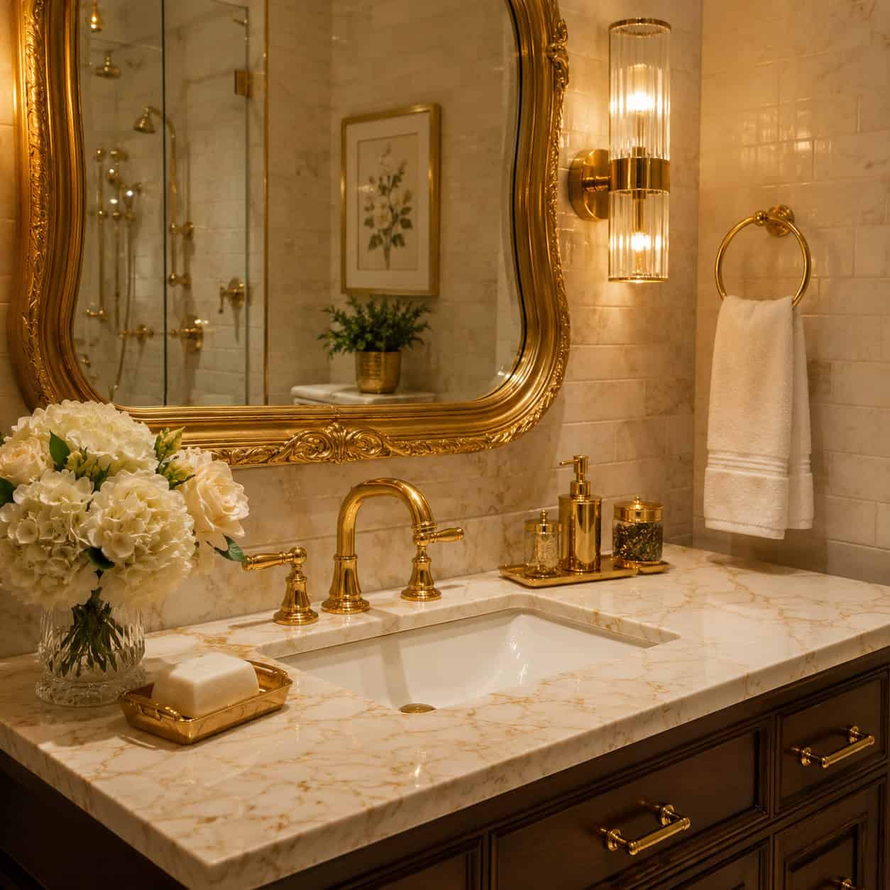
The cure that became the disease.
When oil-rubbed bronze aged out, warm brass and gold rushed in to replace it — around 2016 to 2020. Gold faucet, gold mirror frame, gold light, gold everything.
And then that became its own cliche. Too much of it, all at once, in every room.
The lesson isn’t that gold is bad. It’s that any finish, applied to every single surface, becomes a timestamp. Mix your metals a little. Let one warm accent do the work instead of ten.
That’s the whole trap, really — total commitment to one look on every surface.
The Pattern Behind All of It
Look back over the list and one thing repeats. The 2015 mistake was rarely the item itself. It was going all in — gray on every surface, gold on every fixture, one texture on every wall.
Trends age. Restraint doesn’t.
You don’t need to gut the room to pull it into the present. Repaint the gray. Swap the bronze faucet. Trade the barn door for a pocket door. Small changes shift the whole date stamp.
Fix the three loudest things first, and nobody will guess the year.