

A buyer walks in. They don’t say anything. But their eyes have already done the math.
It takes about four seconds. A backsplash here, a cabinet color there, a faucet catching the light — and the whole room gets filed under “needs work” before anyone opens a drawer.
None of it is falling apart. That’s the frustrating part. The boxes are solid, the granite’s intact, the appliances still run. But the room reads 2005, and 2005 is exactly the year buyers subtract from what they’re willing to pay.
Most of these tells are tiny. A trim profile. A tile band. A finish. Fixing them rarely means gutting anything — it usually means swapping one small thing that’s been quietly time-stamping your kitchen for two decades.
Here are 27 details that give the age away the second someone walks in.
1. Tumbled travertine backsplash with accent dots
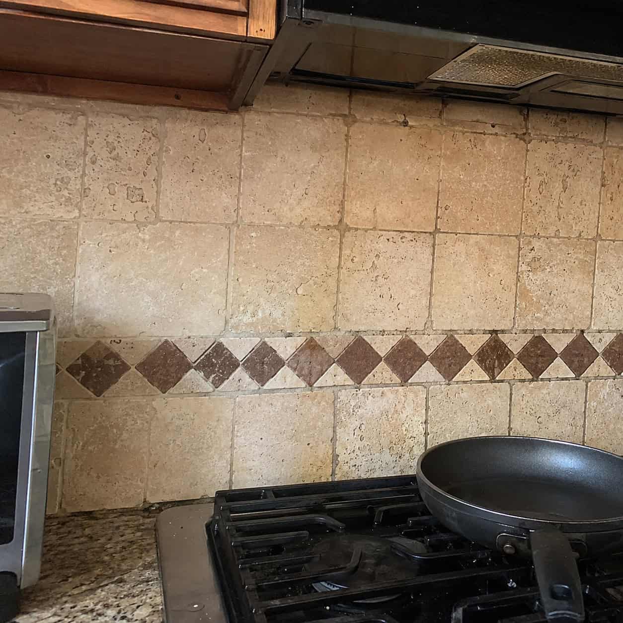
Rough, porous, matte, beige. Usually with a little diamond dot inset marching across the middle.
Nothing pins a kitchen to the early 2000s faster. This was the signature move of the Tuscan era — the “old world” texture everyone wanted, uneven edges and all.
The problem is the color and the roughness read as tired now, not warm. And the porous surface grabs grease you can never fully scrub out.
Buyers see it and mentally start pricing a new backsplash. Designers who’ve spent years reworking these kitchens pull this off the wall first.
2. Busy gold-and-brown speckled granite
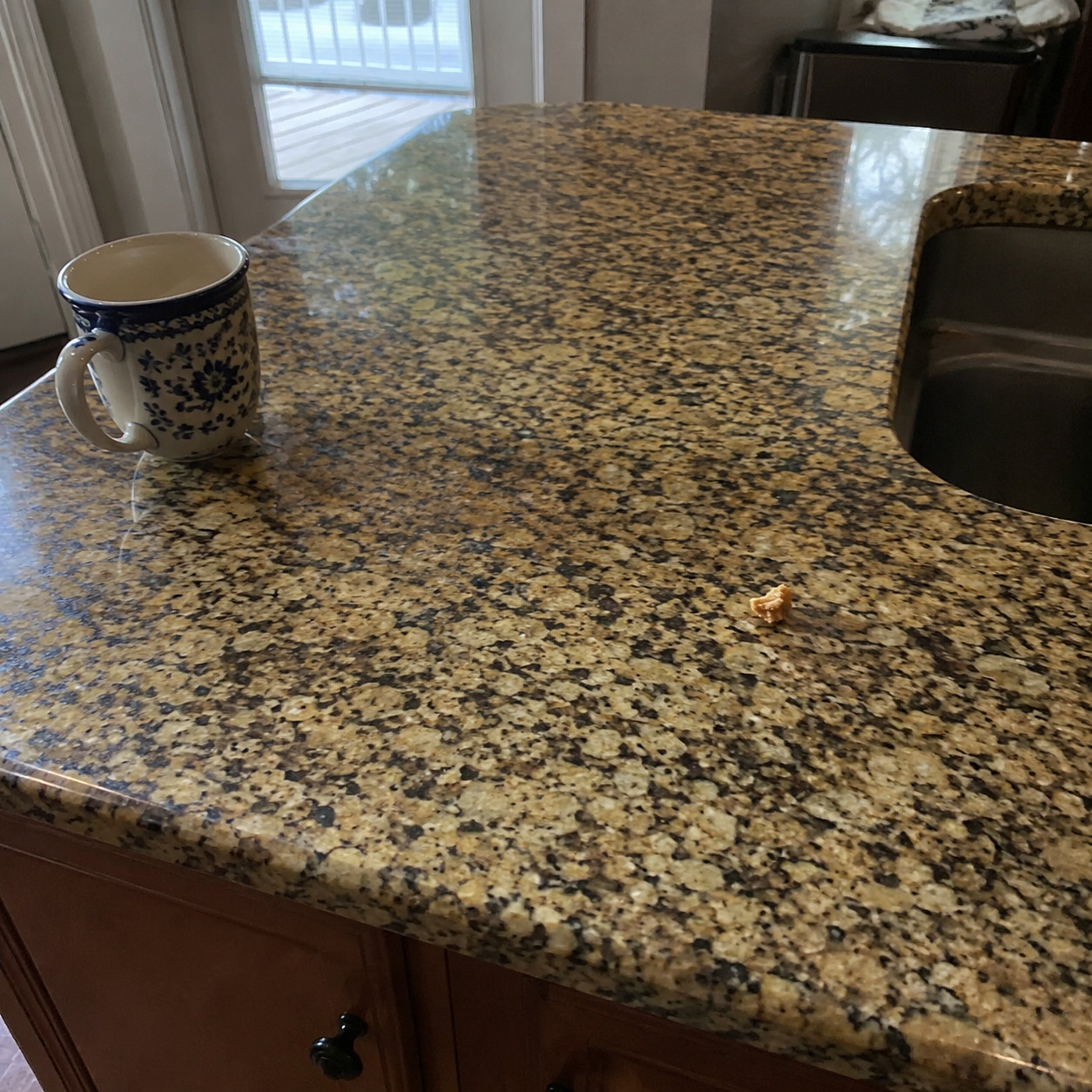
New Venetian Gold. Ubatuba. The names alone date the counter.
Back when granite still meant luxury, the busier the slab the better — dizzying speckle, gold veins, flecks of a dozen colors. It said you’d spent money.
Now the eye reads all that movement as chaos. Today’s buyers want quiet: soft quartz, honed slabs, one calm tone across the whole run.
The stone itself is bulletproof. It’s the pattern that ages it.
3. Ogee-edged, bullnosed countertop profile
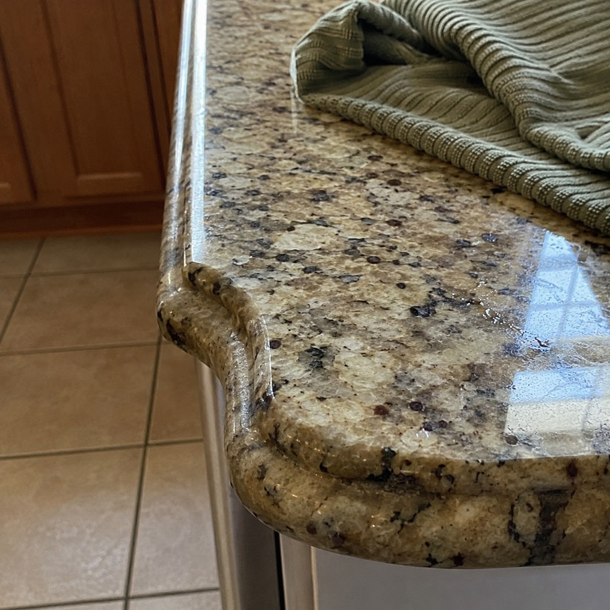
Look at the edge of the counter, not the top.
A fussy ogee curve or a fat rounded bullnose dates a countertop even faster than the stone does. It’s the fingerprint of 2000s traditional builds.
Modern counters run flat — an eased square edge or a crisp mitered corner. Nothing carved.
Buyers clock the difference without knowing why. The profile just feels old.
4. Honey-oak or orange-stained raised-panel cabinets
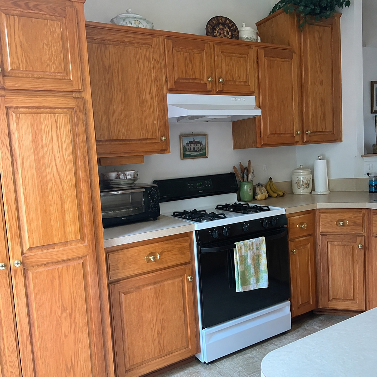
Warm orange wood with an ornate raised-panel door. That’s the cabinet fingerprint of the aughts.
Maple and oak took that honey stain and never let go of it. Even boxes built like tanks read dated because of the color and the fussy door profile.
The fix often isn’t new cabinets at all. Plenty of these kitchens get rescued with paint and flatter door fronts.
Solid wood, wrong decade.
5. Oil-rubbed bronze hardware and faucet
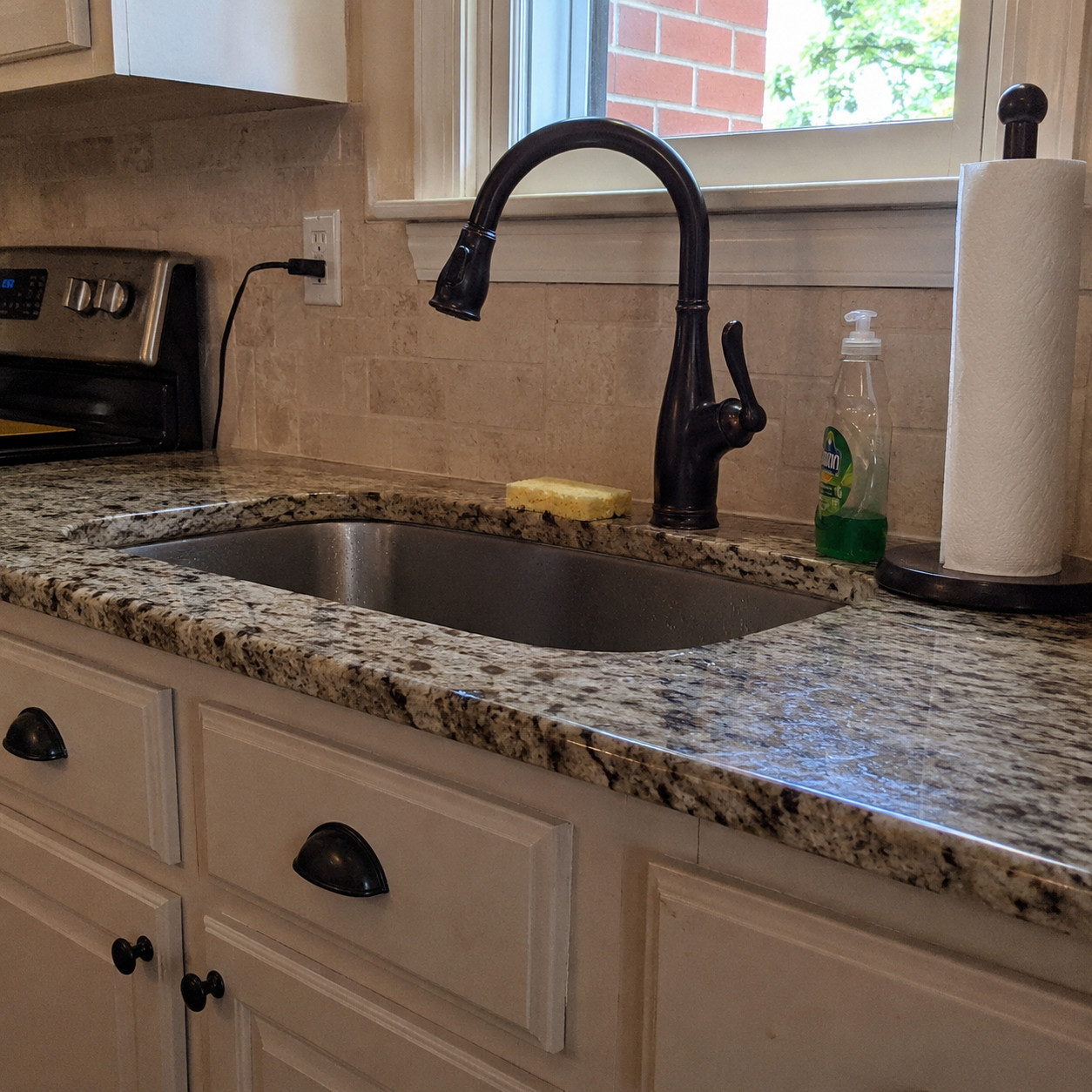
Dark, warm, slightly bulbous. ORB knobs, pulls, and a matching gooseneck faucet.
This was the go-to metal of the Tuscan years. It paired so tightly with cherry cabinets and gold granite that the three together practically shout the year.
Swapping the faucet alone shifts the whole room. Brushed nickel, matte black, or polished chrome pulls it forward a decade — and if you’re unsure which suits your sink, the difference between polished chrome and polished nickel is smaller than most people think.
Finish is cheap to change. Change it.
6. Sponge-painted or faux-finished beige walls
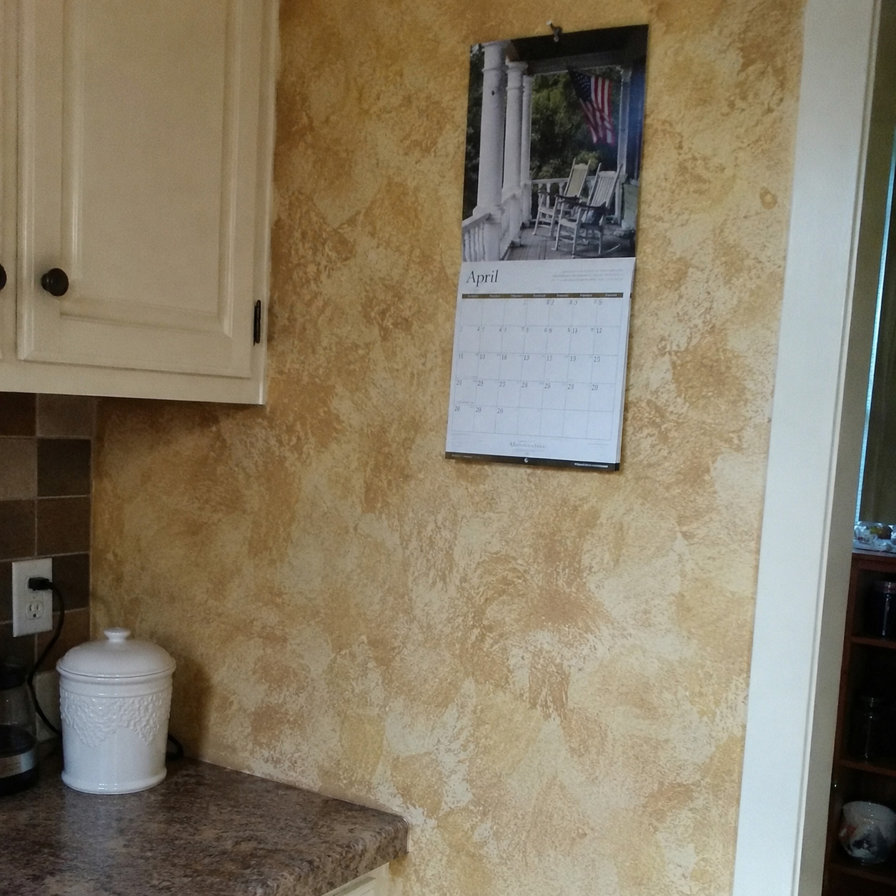
Mottled. Ragged. Gold layered over beige to fake old plaster.
The “Tuscan plaster” faux finish was everywhere from the late ’90s into the mid-2000s. It was supposed to look aged and expensive. It just looks theatrical now.
Buyers want clean warm-neutral paint — flat color, no drama. Zillow’s research even puts real dollar figures on the right neutral tones at sale time.
A single coat of solid paint erases this one overnight.
7. Travertine tile floors
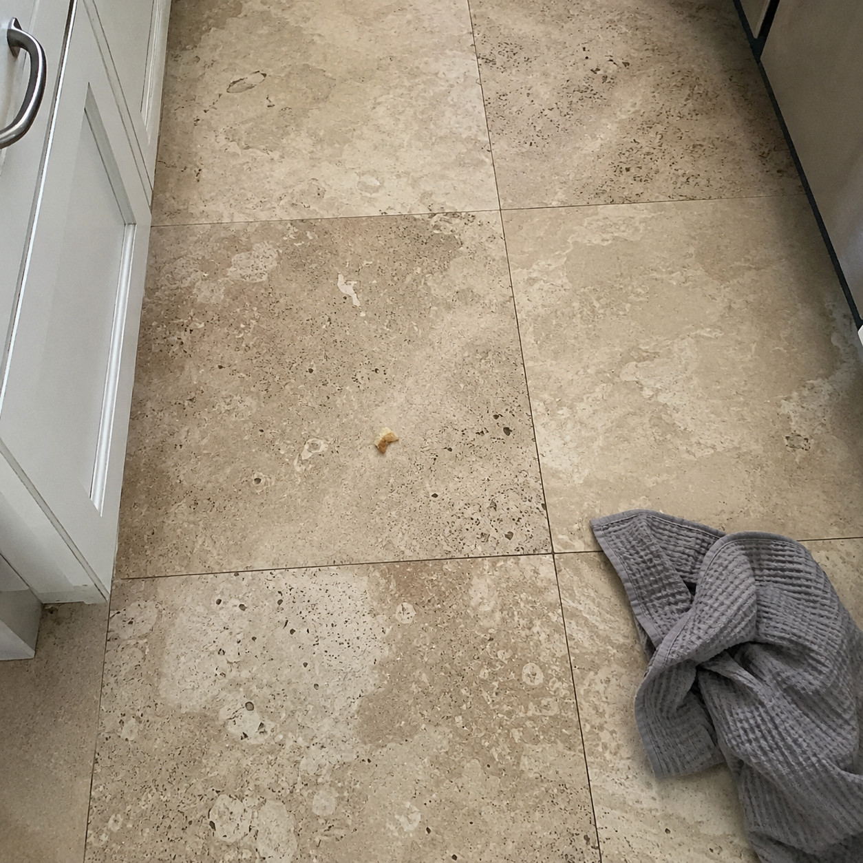
Beige and tan underfoot, blotchy and busy, usually paired with dark wood cabinets.
Travertine floors were the default in aughts kitchens. The color and the mottled pattern date the room even when the tile is structurally perfect.
Wide-plank wood and large-format porcelain replaced it — bigger pieces, fewer grout lines, calmer tone.
The stone lasts forever. That’s the trouble. It’s still there, still saying 2005.
8. Wrought-iron pot rack overhead
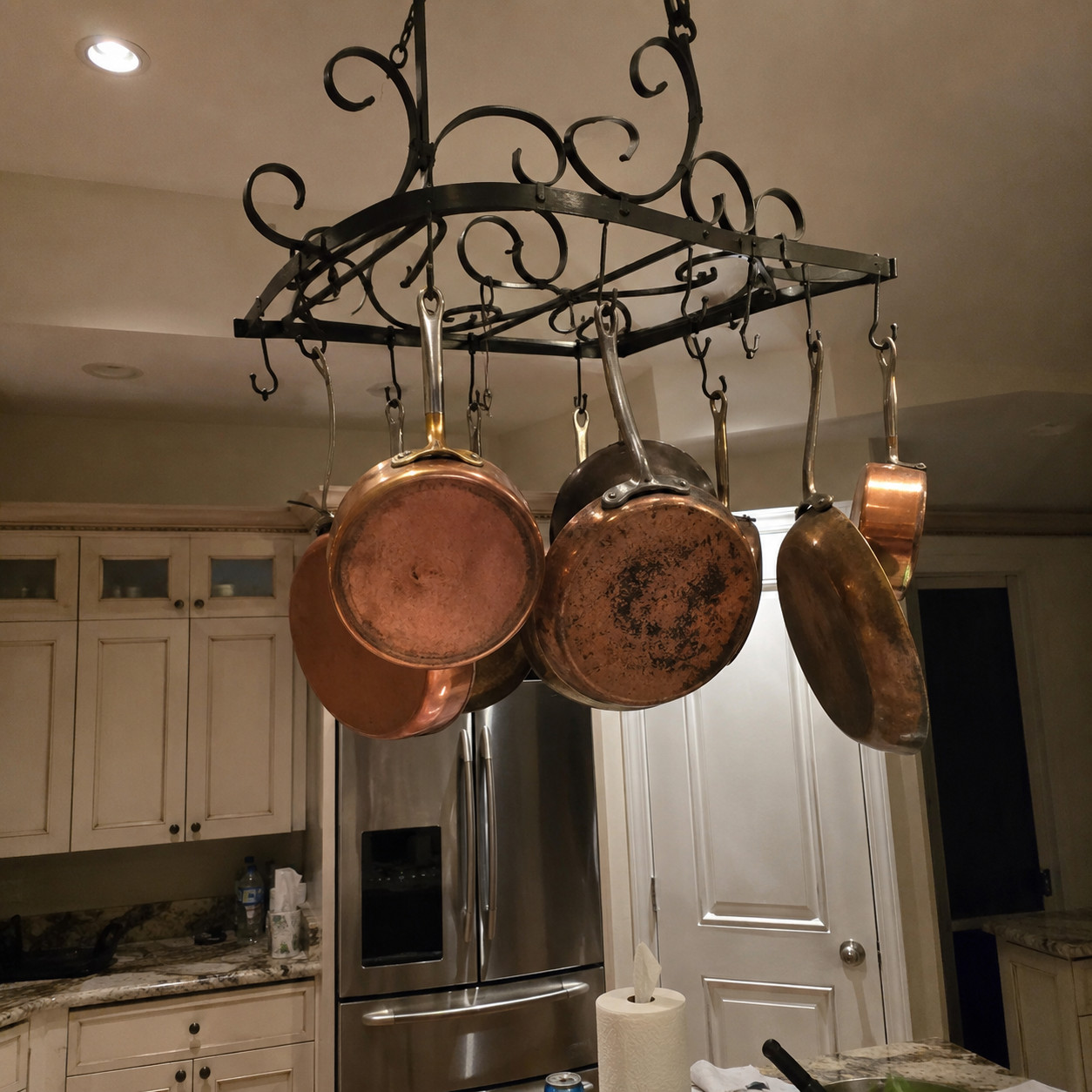
Scrolled black iron, hanging over the island, dangling copper pans.
This was shorthand for a serious cook’s kitchen in the aughts. Wrought iron was on everything back then — racks, lighting, hardware, the works.
Now it just eats headroom and casts shadows over the prep space. Buyers read it as clutter with a decade stamped on it.
Take it down before the first showing.
9. Carved corbels and curlicue island legs
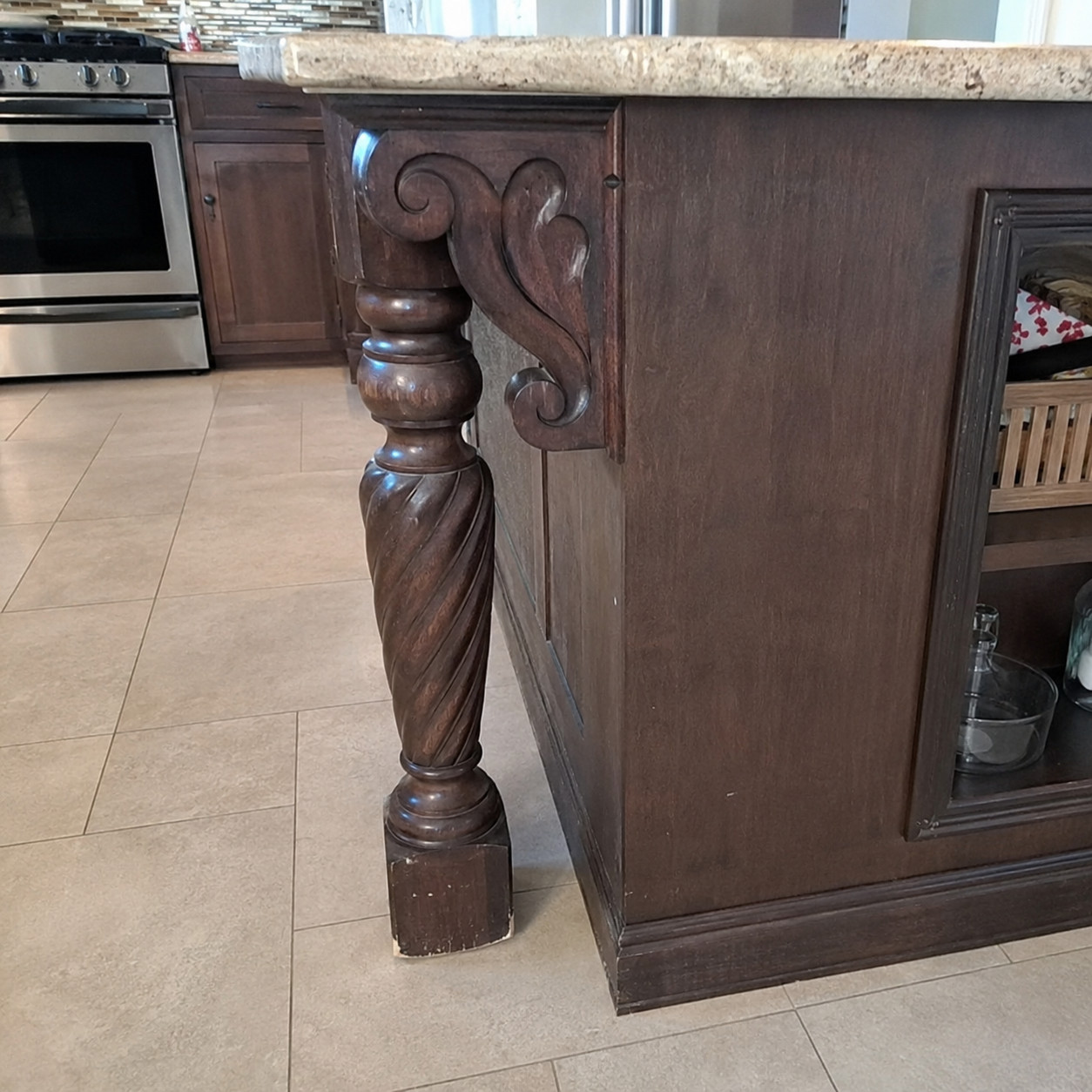
Chunky decorative brackets. Turned, carved legs on the island corners.
This was the era’s idea of luxury — the more ornamentation, the fancier it felt. Old-world detail, layered on thick.
Buyers now read all that carving as heavy and dated. Designers have a phrase for the update: delete the curlicues.
Clean lines win. The scrollwork ages the whole island.
10. Awkwardly angled, multi-shape island
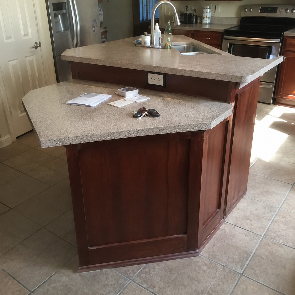
Triangles. Odd jutting corners. An island with three different depths for no clear reason.
These strange footprints were a builder-carpenter special of the era. They looked custom. They mostly just wasted space.
Modern islands get squared off into a clean rectangle. When the odd angles are still there, it’s a sign the kitchen hasn’t been touched since it was built.
The shape itself is the tell.
11. Two-tier raised breakfast bar
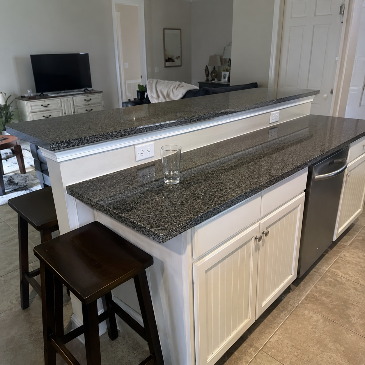
A stepped-up second level running along the back of the island, a few inches taller than the counter.
The whole point was hiding dirty dishes from anyone sitting on a bar stool. Classic late-’90s to mid-2000s move.
Islands run one flush level now — better for prep, better for serving, better in photos. The raised ledge dates the layout instantly.
Flush is the new fancy.
12. Glass mosaic accent strip backsplash
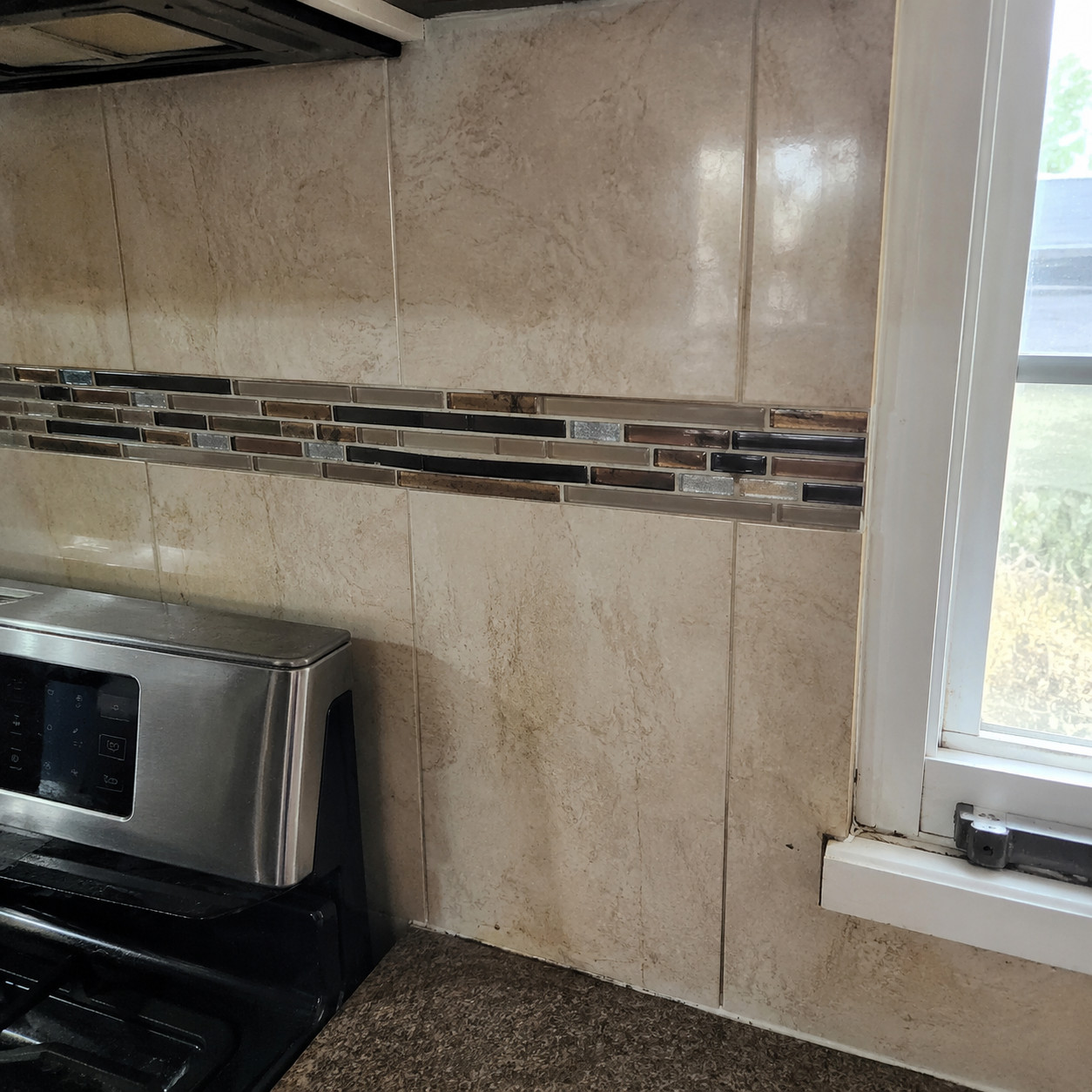
A shiny little band of tiny glass tiles running like a stripe through the middle of the backsplash.
This was the aughts trying to look modern. The glass “liner” felt current at the time — a splash of shimmer in an otherwise earthy room.
Designers now flag it as the builder-grade look of the 2000s. It reads busy and cheap next to a clean field of tile.
One stripe, whole decade.
13. Rope-trim tile medallion behind the cooktop
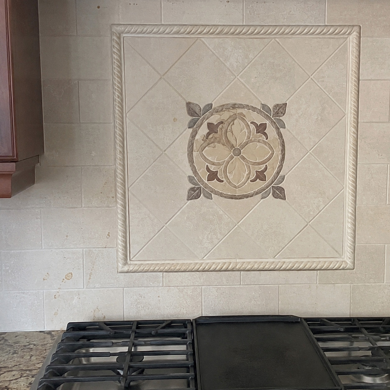
A framed “picture” of decorative tile above the range, bordered with a twisted rope-trim molding.
Hyper-specific to 2000s traditional kitchens. It was meant to be the focal point — the fancy centerpiece over the stove.
Now it reads as fussy the moment a buyer looks up. The rope border especially. It’s a frozen snapshot of the era.
Nobody’s framing their backsplash anymore.
14. Over-the-range microwave
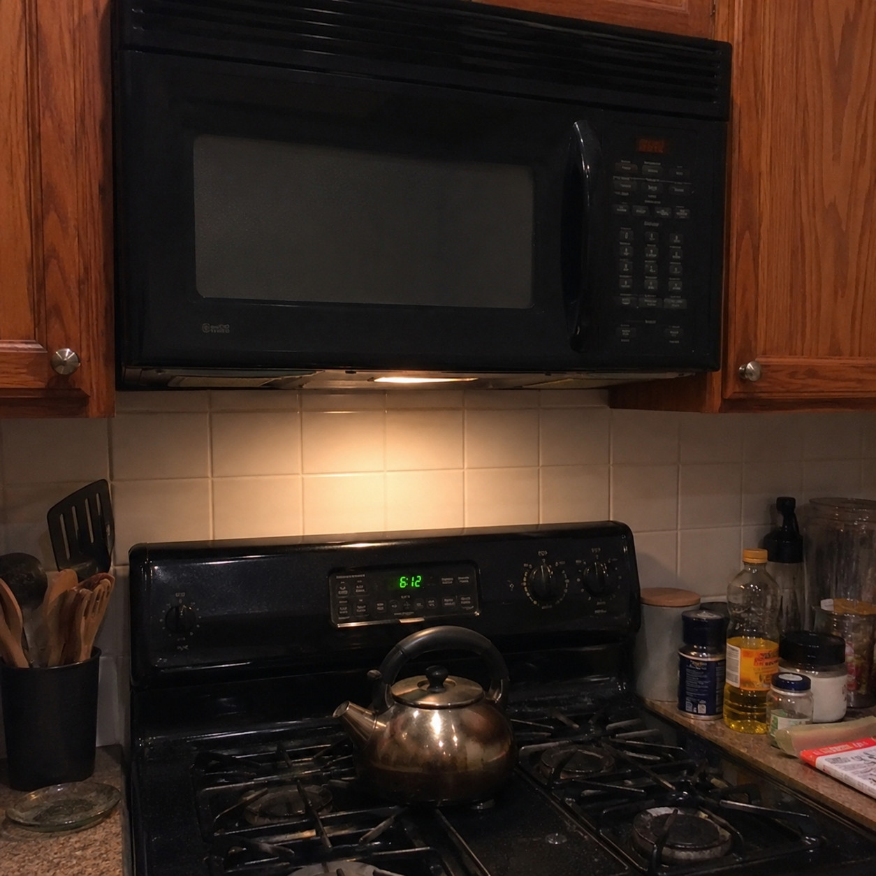
The bulky OTR microwave doing double duty as your vent hood.
Builder standard in the aughts. It saved a cabinet and skipped the cost of a real hood, so it went into nearly every spec kitchen.
Buyers now expect an actual range hood — and read the microwave-over-stove combo as a shortcut. It’s one of the first swaps in these Tuscan updates.
The weak fan and low clearance don’t help either.
15. Black appliances
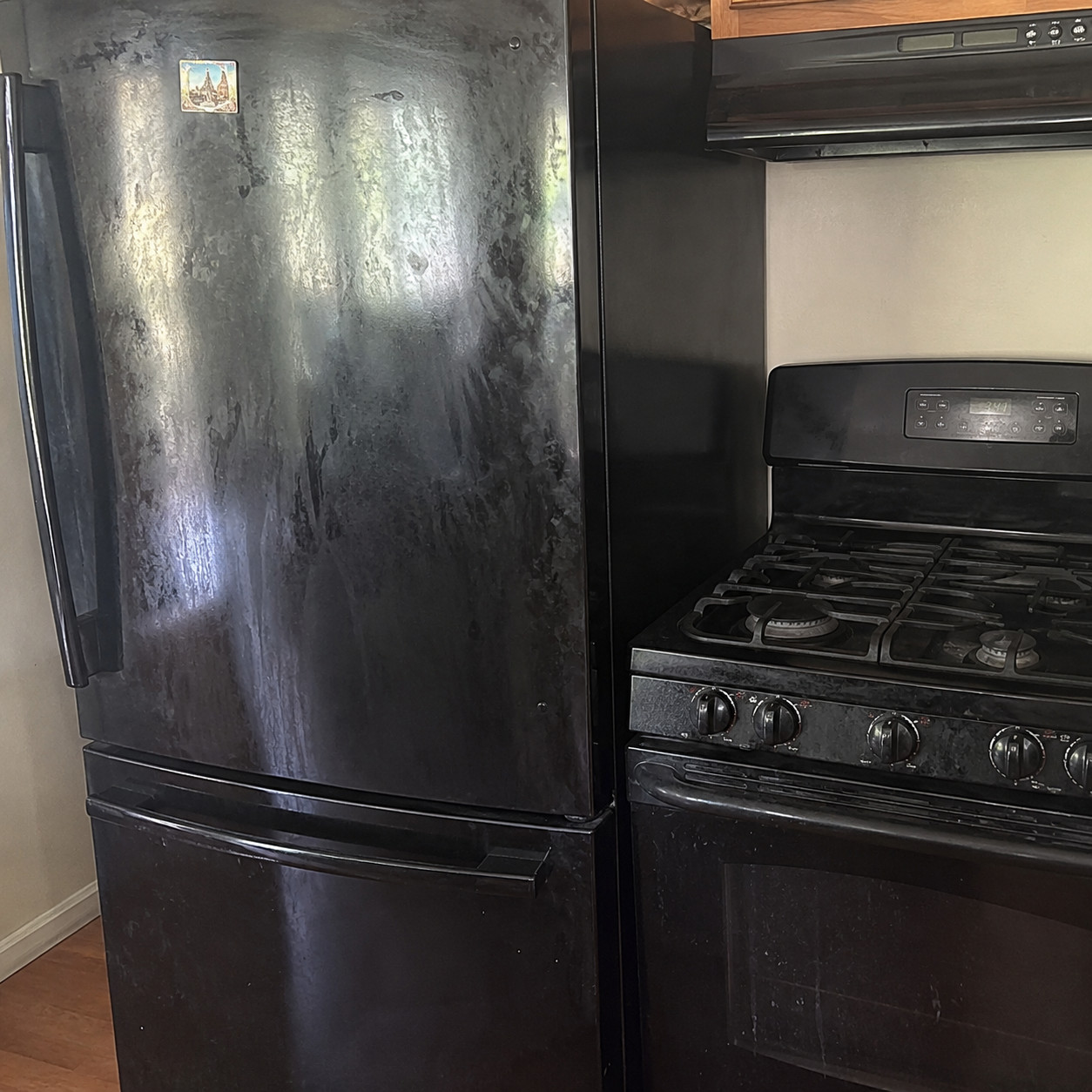
Black fridge, black range, black dishwasher — a full matching suite.
Before stainless took over, this was the affordable upscale choice. Black-front appliances looked sleeker than white and cost less than the steel everyone secretly wanted.
A full black lineup pins the kitchen firmly to the aughts now. It also swallows light and shows every smudge.
Dated, and hard to keep clean.
16. A wall of matching stainless-steel appliances
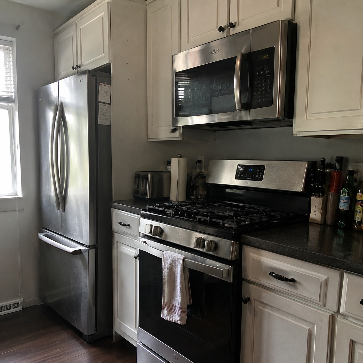
The thing everybody upgraded to. Now the thing that dates the room.
Stainless everything was the height of fashion in the 2000s — a genuine status symbol. That ubiquity is exactly what ages it. When every kitchen has the same steel wall, none of them feel current.
Paneled and integrated appliances have moved in at the high end, blending into the cabinetry instead of announcing themselves.
And stainless is still a fingerprint magnet, as anyone who owns it wipes down daily knows.
17. Drop-in double-bowl 50/50 stainless sink
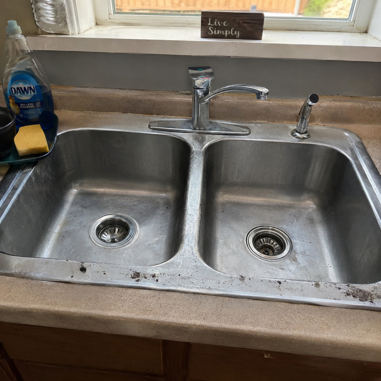
Two equal bowls, a visible rim sitting on top of the counter, a divider straight down the middle.
Standard issue in the 2000s. Buyers now want one big undermount bowl — room to lay a sheet pan flat, no divider fighting you.
The rim is the quiet tell. Grime collects along that lip no matter how often you clean it, and undermount is exactly what replaced it. If you’re weighing the swap, the case for overmount versus undermount comes down to that seam.
A small detail that reads old fast.
18. Tambour-door appliance garage
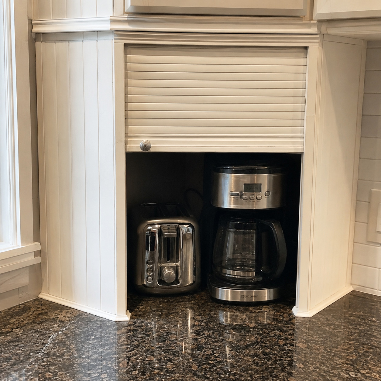
The roll-up “garage” in the corner of the counter, hiding the toaster and the coffee maker behind slatted wood.
People loved these in the ’90s and into the 2000s. Slick idea — clutter tucked away with one pull.
Then the tambour hardware stuck, jammed, and wore out. The little door never rolled smoothly again.
Buyers read it as vintage. Charming, maybe. Old, definitely.
19. Built-in kitchen desk nook
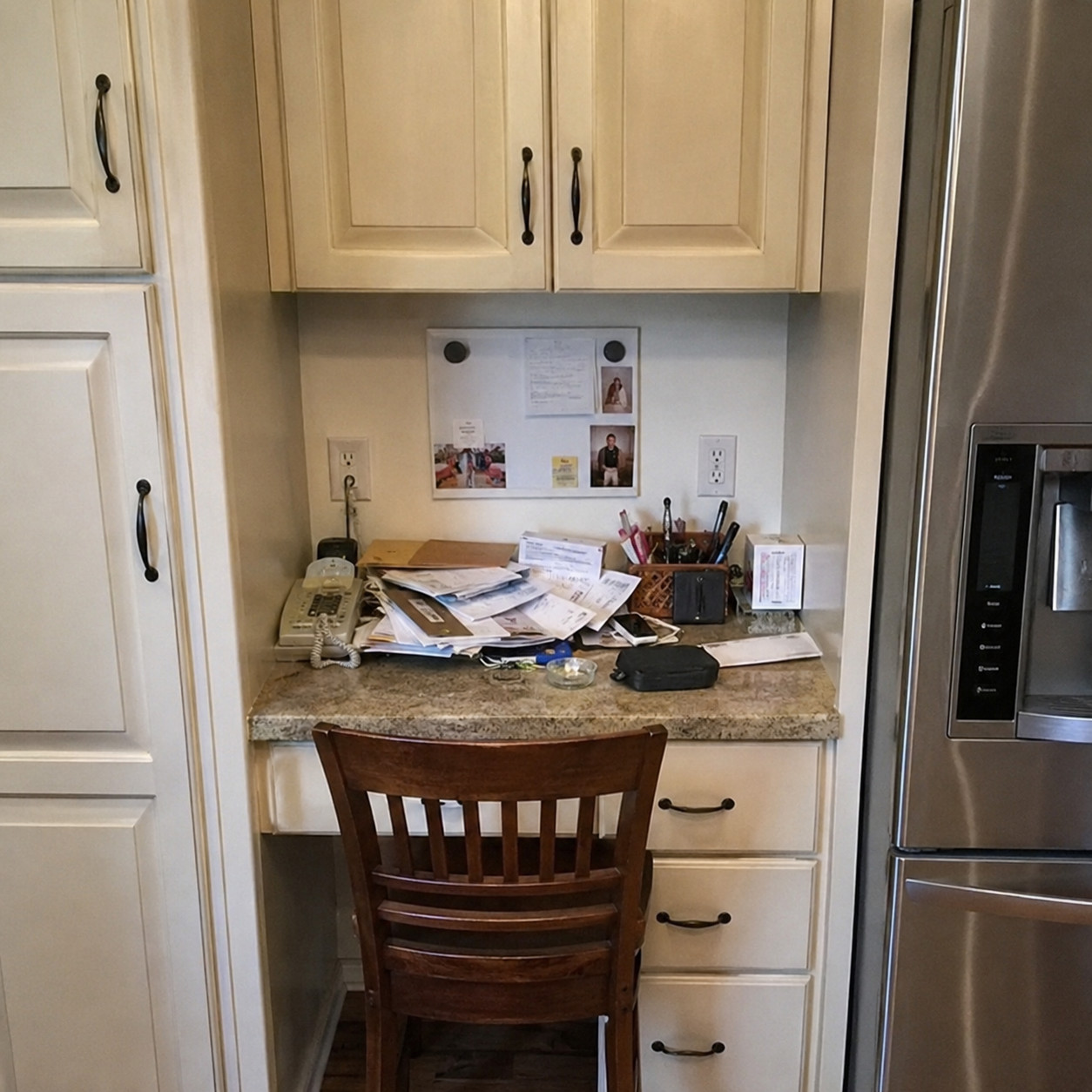
A little run of cabinets flanking a lower desk surface, tucked into the kitchen.
This once held the landline, the phone book, and the family wall calendar. It was command central for the whole house.
The cell phone killed its purpose. Now it’s dead counter space, and renovations are ripping it out to add cabinets or a pantry.
It screams the era it was built for.
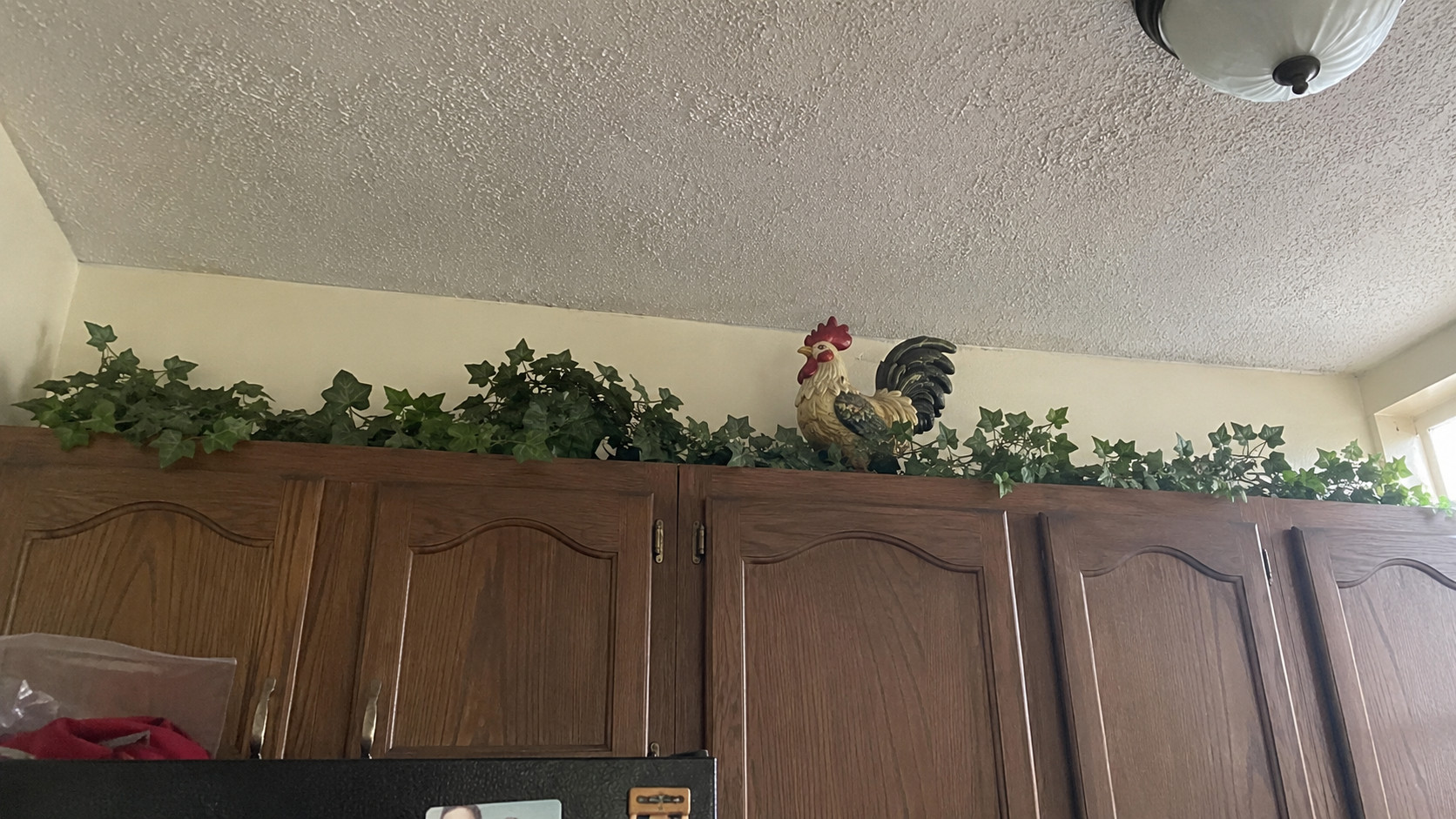
20. Ivy garlands and roosters above the cabinets
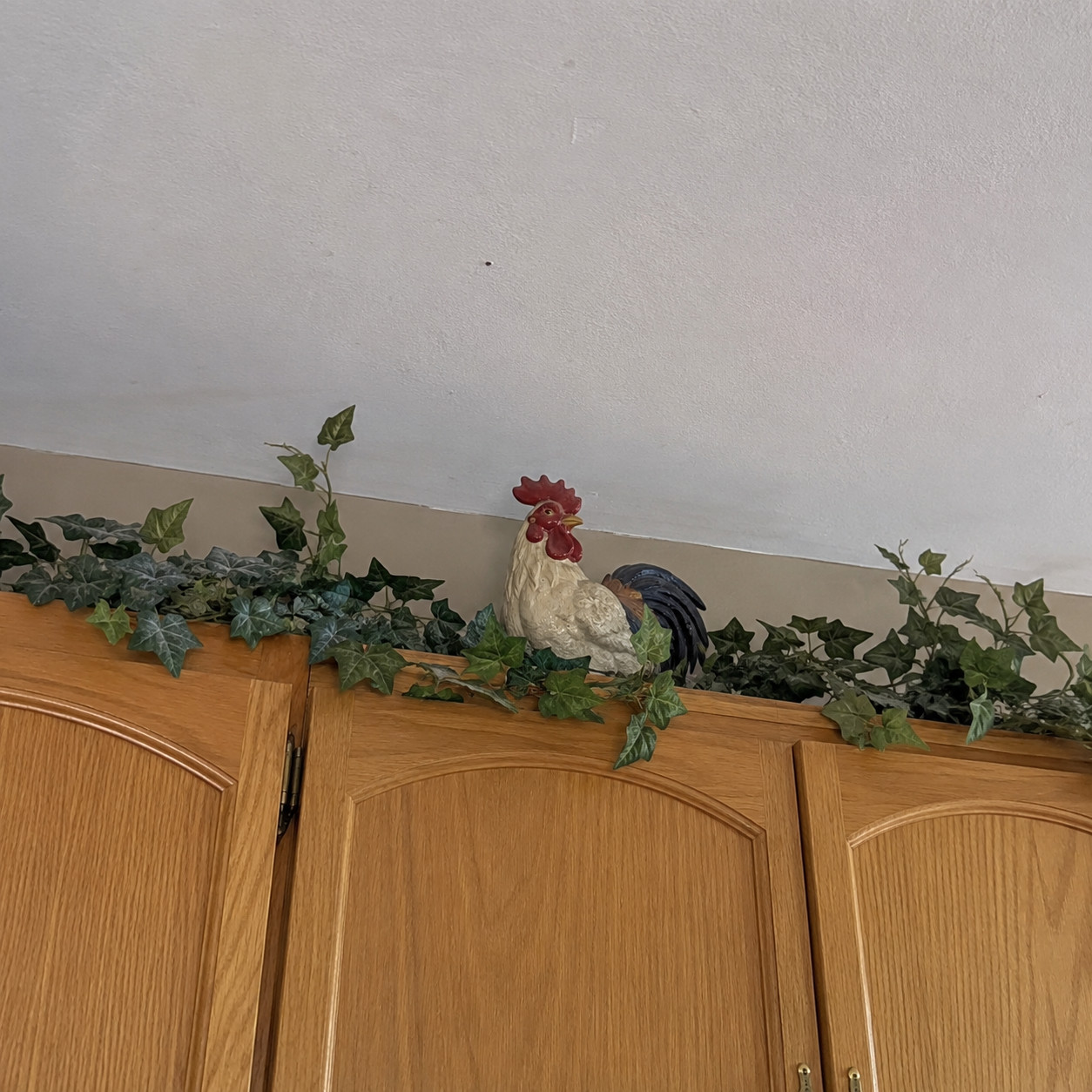
Faux greenery draped along the tops of the uppers. A rooster or two. Maybe a Tuscan urn.
The décor cliché of the aughts, full stop. That gap above the cabinets became a shelf for silk ivy and farm figurines.
Even a beautifully renovated kitchen looks stuck in 2005 the second that stuff is up there.
Clear it off. Cost: nothing.
21. Grapevine and wine-themed décor
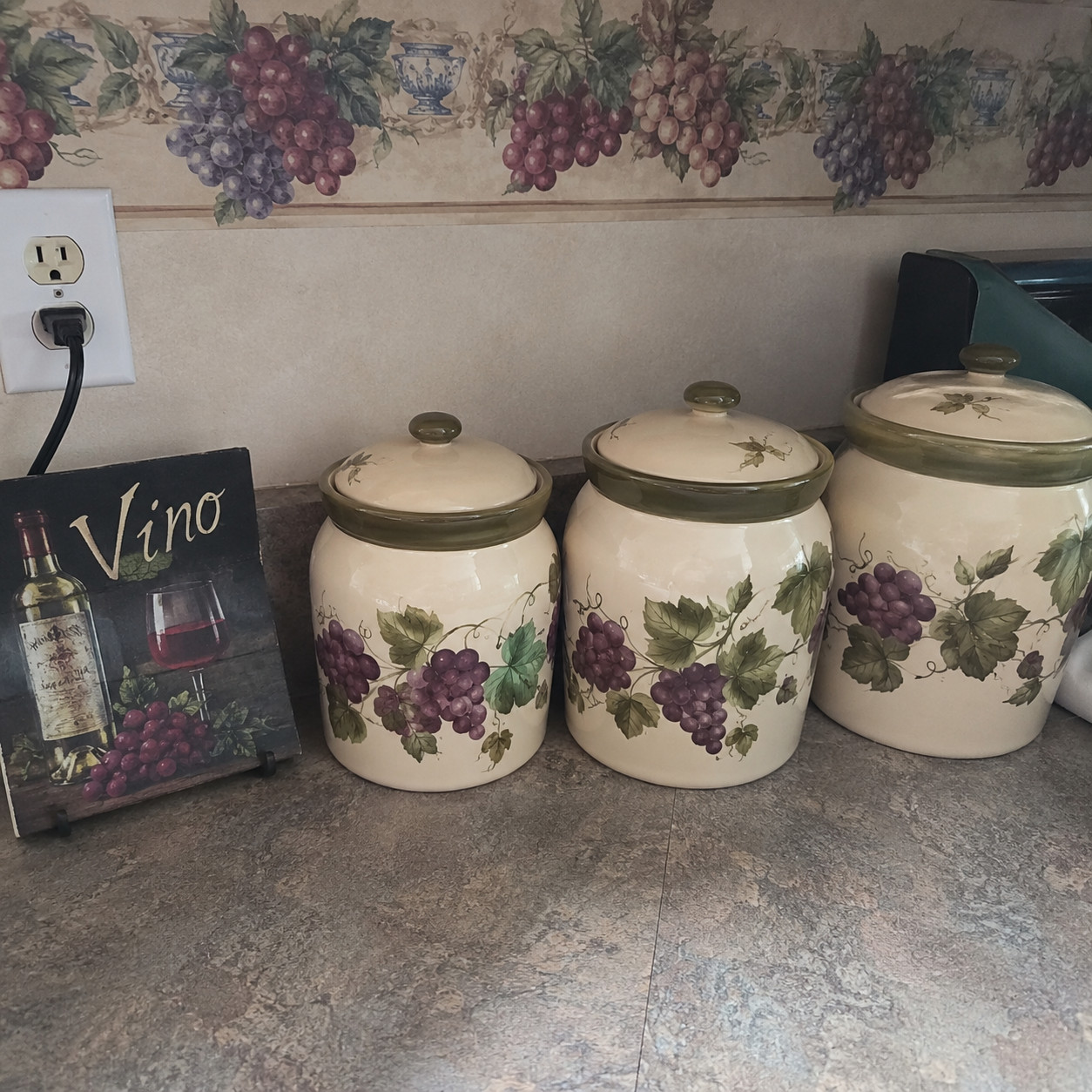
Grape motifs on the wallpaper border. A “Vino” sign. An Italian chef chalkboard by the fridge.
This rode the era’s boom in American wine culture. Grapes ended up on canisters, dish towels, tile insets — everywhere.
It’s a small styling choice, but it signals the Tuscan aughts louder than almost anything. Buyers date the room by the grapes alone.
Pack it before the photos.
22. Scrolled ‘Tuscan’ pendant lights
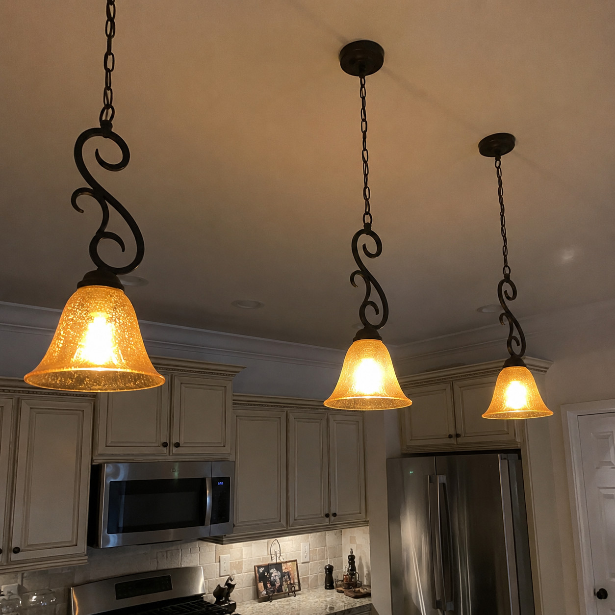
Bronze fixtures with scrolled iron arms and amber or seeded glass shades, hanging over the island.
Pure era artifact. The warm amber glow felt cozy and expensive at the time.
Now it’s the first thing designers swap, because lighting dates a room harder than almost anything else. New pendants shift the whole space forward.
Cheap change, big payoff.
23. Yellowy under-cabinet puck lighting
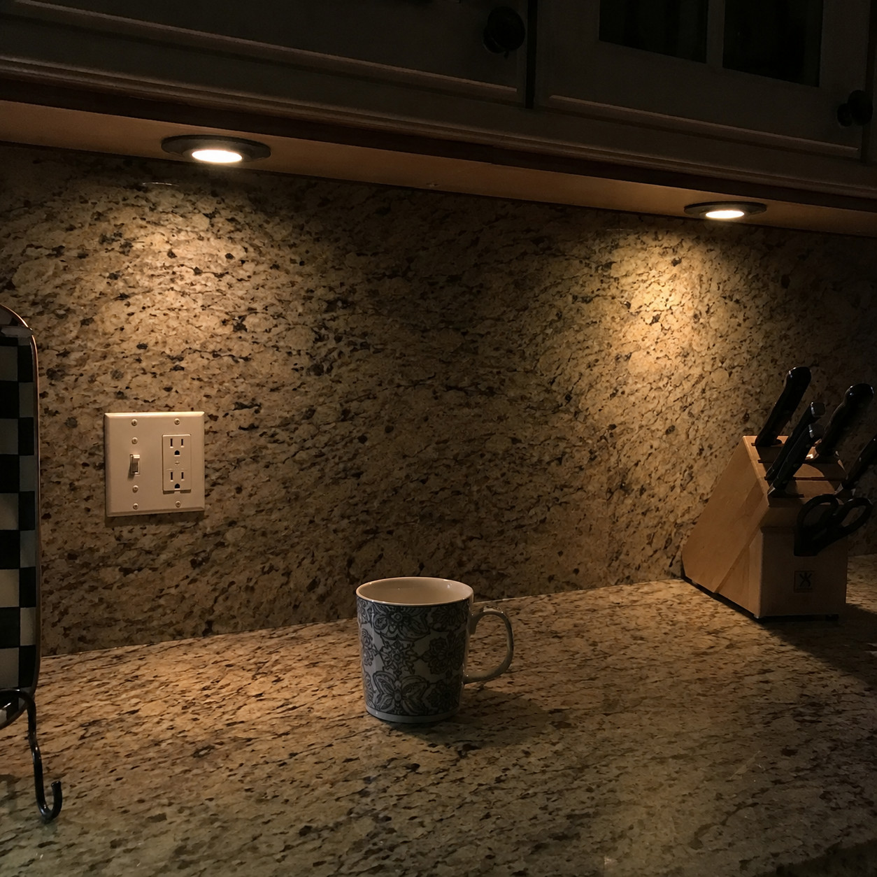
Round halogen pucks dotted under the uppers, throwing little amber pools onto the counter.
Standard task lighting in the 2000s. Warm rope lighting under the cabinets did the same yellow thing.
Today’s buyers expect even, cool LED strips — clean white light across the whole run, no hot spots. The warm puck glow reads old and uneven.
The color temperature gives it away.
24. A grid of recessed can lights
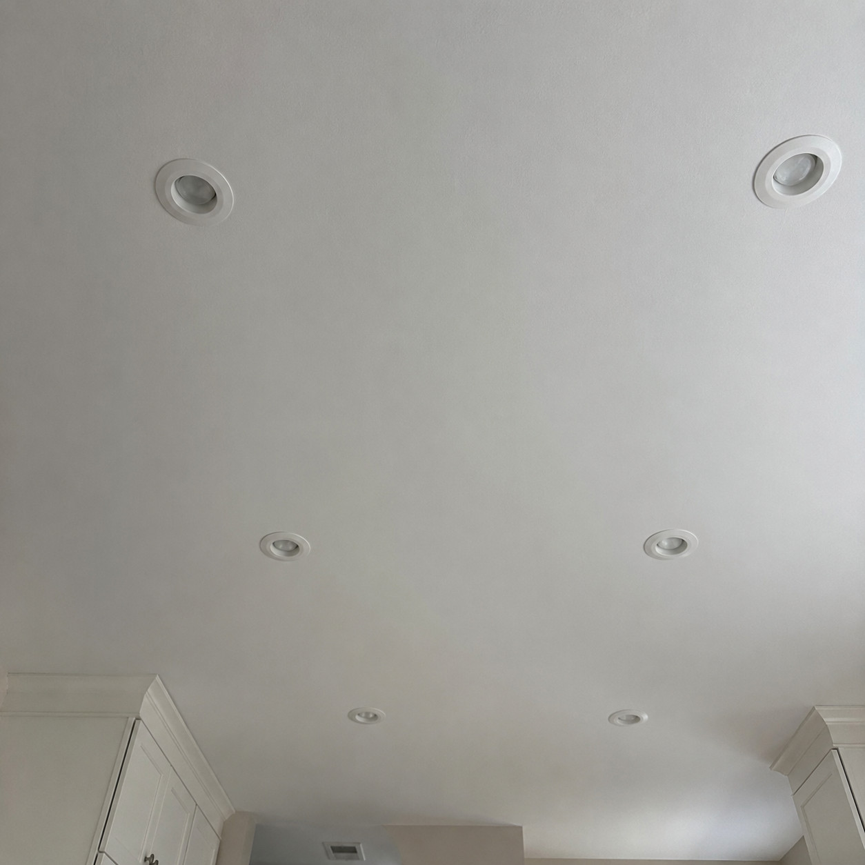
Rows of six-inch cans punched across the ceiling as the only source of light. Nothing layered, nothing statement.
A builder signature of the era. Cans went in by the dozen and called it done.
Buyers now read a flat grid as unfinished — no pendants, no under-cabinet layer, no personality. Designers flag it as one of the things that make a kitchen look dated.
Even light, zero character.
25. Ceramic tile countertops with grout lines
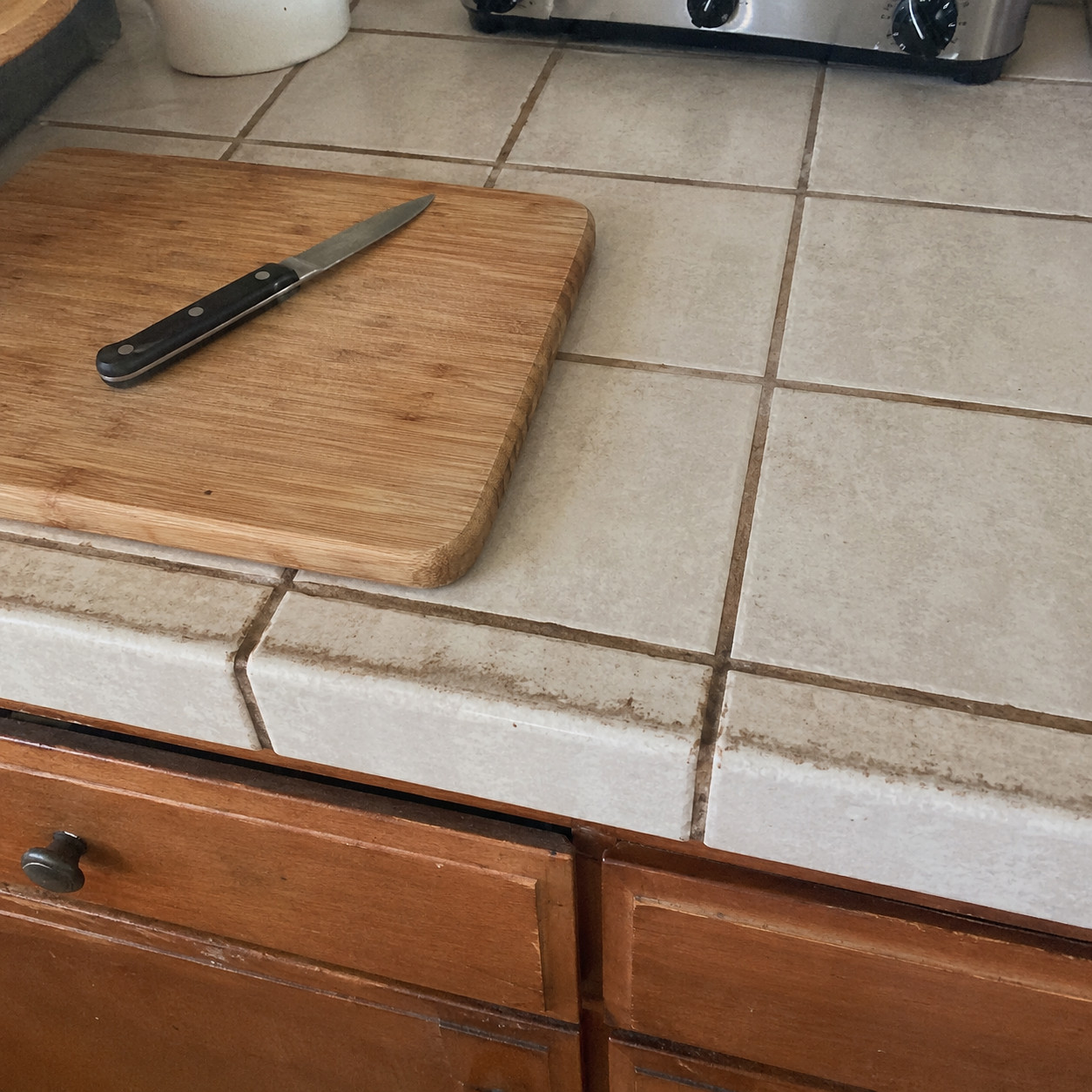
A countertop made of individual tiles, grout running between every one of them.
More of a ’90s holdover, but budget 2000s kitchens still had them. The grout is the killer — stained, cracked, impossible to keep looking clean.
The finishes that date a counter split cleanly by decade. Here’s the quick read:
| Dates The Kitchen | Reads Current | |
|---|---|---|
| Counter surface | Ceramic tile + grout | Slab quartz or stone |
| Edge profile | Ogee or bullnose | Flat eased or mitered |
| Backsplash | Tumbled travertine | Clean field tile |
| Sink | Drop-in 50/50 | Single undermount bowl |
Slab surfaces won for a reason. No grout lines to stain, nothing to scrub, one wipe and done.
26. Bisque / almond-colored appliances
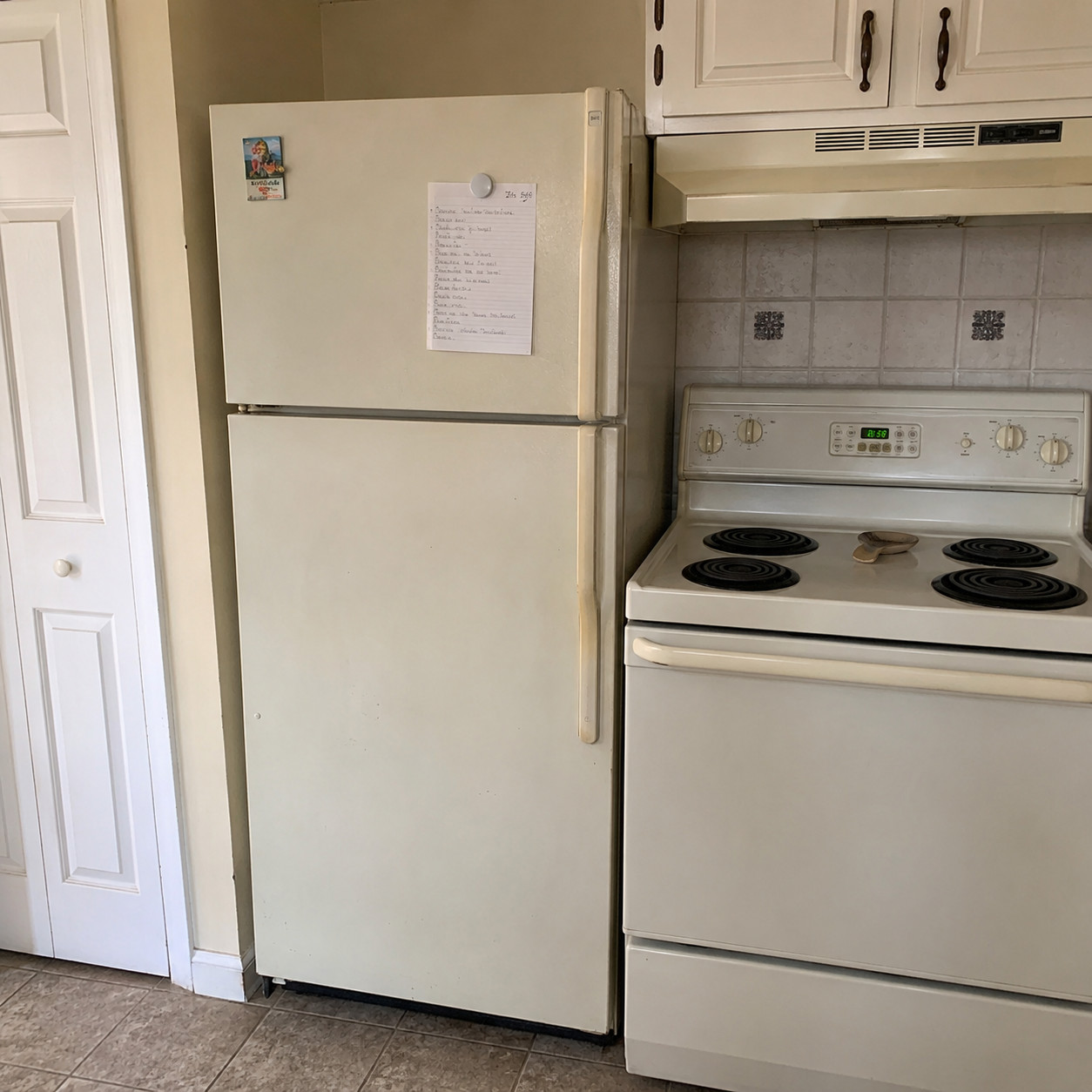
A softer off-white — not quite cream, not quite tan. Fridge, range, and dishwasher all in that muted almond.
Fading by the 2000s but still hanging around in plenty of kitchens. It skews a touch earlier than the twenty-year mark, but it lands the room squarely in “hasn’t been updated.”
Gentler tell than a black suite. Same verdict, though.
Almond dates a kitchen quietly.
27. Fluorescent box ceiling light
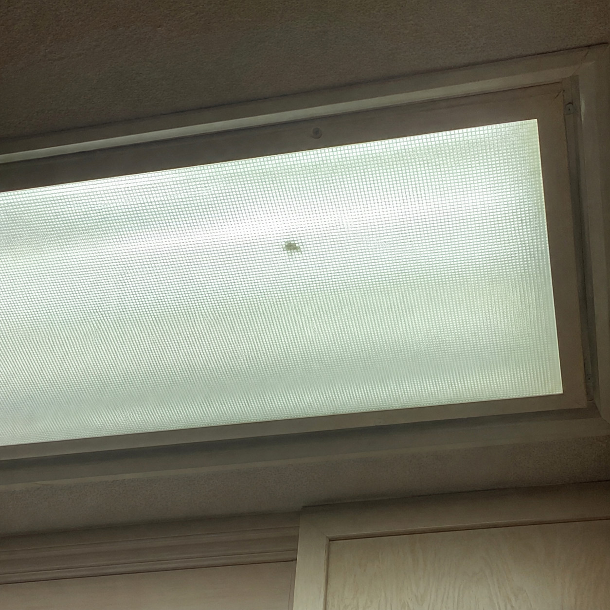
The flat “lightbox” recessed into the ceiling — a big frosted panel with fluorescent tubes humming behind it.
This one leans ’90s more than mid-2000s, but it’s a powerful dated signal wherever it survives. The flat, greenish, buzzing light is unmistakable.
Buyers look up, see the box, and file the whole kitchen accordingly. A flush LED fixture erases it in an afternoon.
Nothing ages a ceiling faster.
Conclusion
Notice how few of these need a contractor. Most are a finish, a fixture, or something you can carry out the door.
That’s the good news. The bones of a 2000s kitchen are usually fine — solid cabinets, real stone, appliances that still run. It’s the surface details doing the aging, and surface details are the cheapest thing to change.
Zillow’s own sale-price research keeps landing on the same lesson: the right small features move the number more than a full gut job ever pays back.
Walk your kitchen like a buyer would. Whatever your eyes snag on first — that’s the thing quietly costing you money.